
Changing websites
Written by Mat and Kat
As part of our tenth-anniversary celebrations, we wanted to have a look back at some of the websites that we've been managing for years, and highlight what's changed on the web in that time.
Here are seven websites that highlight how the web has changed over the last decade.
Cornwall Healthy Schools
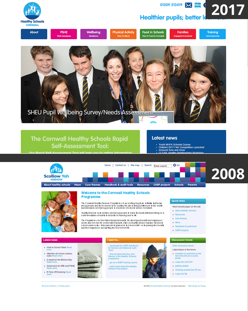
We've been working with the team at Cornwall Healthy Schools for a long time. We built the first incarnation of the site back in 2008, and this is the third complete redesign that we've done.
The original site was designed for what you'd now say is quite a small screen size, 970px wide, but at the time this was standard.
Mobile web browsing wasn't yet a thing, so the 2008 site wasn't set up for mobiles. The 2017 site, in contrast, looks beautiful on any device and any screen size.
The biggest difference between the two sites is that the new site has significantly fewer pages than the first site that we built. Originally the website had over 600 pages of text, and there are now fewer than 100. This makes it much easier to find the information the visitors is looking for!
Gloucester Healthy Living and Learning
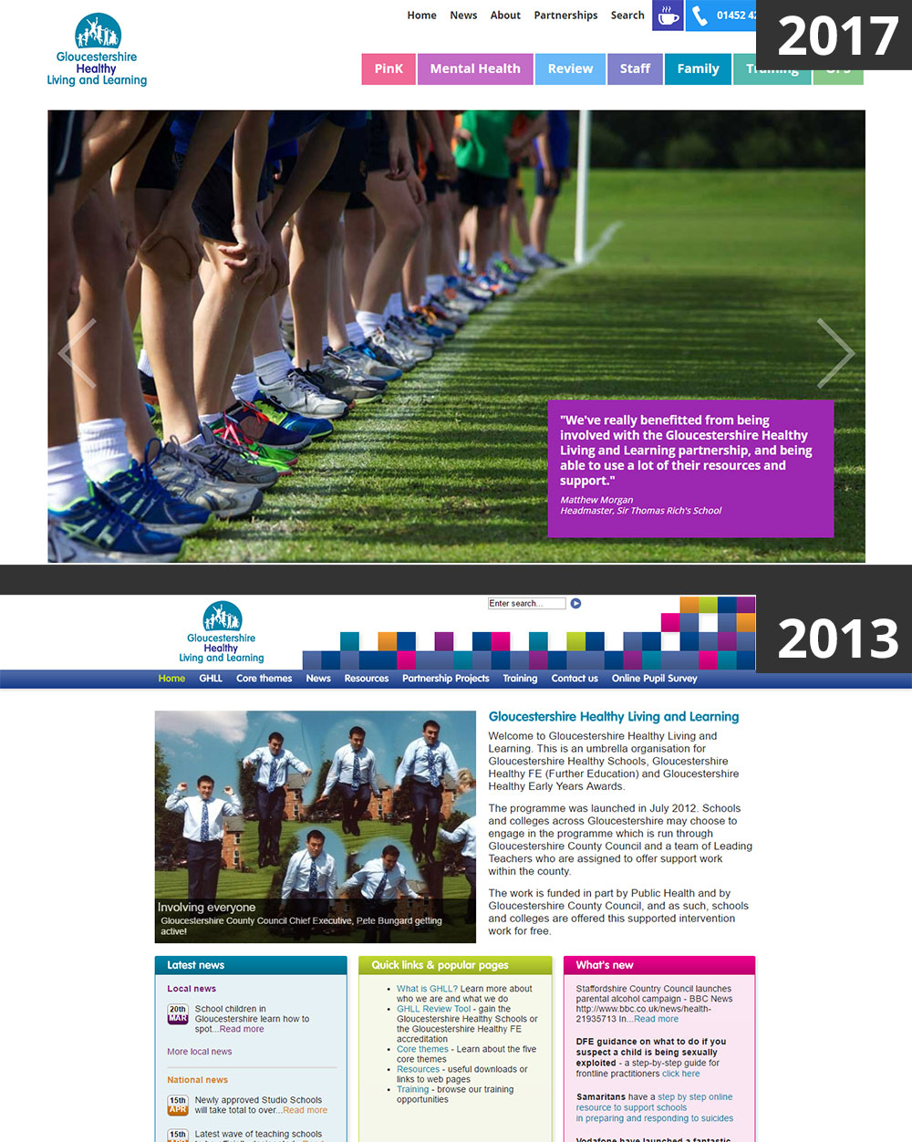
If you're thinking that the old Gloucester Healthy Living and Learning (GHLL for short) website looks an awful lot like the old Cornwall Healthy Schools website, you'd be right! Both projects came out of what used to be the national Healthy Schools Programme, and both websites wanted to retain some of the branding from that programme.
What's really interesting is how they've diverged since then, but looking at the current websites they retain a little of their heritage - in their logos, but also in their bold use of colours.
The old GHLL website was very text heavy and used images sparingly, whereas current GHLL website makes much better use of the screen space, with a large bold home page image.
Gripsure
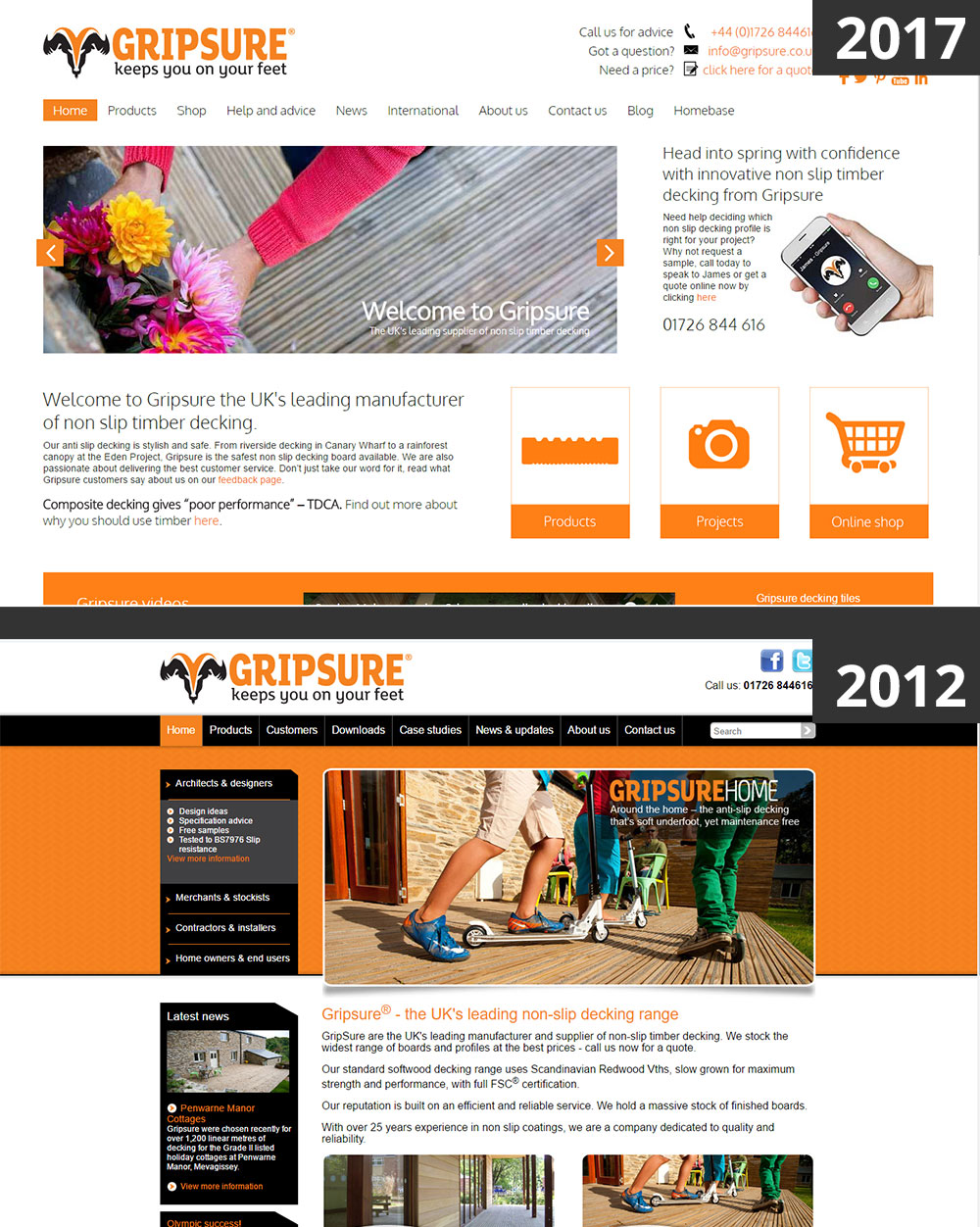
When we started working with Gripsure five years ago they'd just been through a rebranding exercise and wanted a new website that went along with their ambitious growth plans. The original website had a very technical feel, with cut-corner motifs and complex shading and gradients. Over time the look of the site has become simpler and more serious as the company expanded and web design fashions changed to be more minimal.
As the company has grown over the years we've built several different versions of the website to meet their changing needs, most recently adding an online shop featuring live stock tracking and express delivery options. As they've expanded overseas we've also built them websites in France, Germany and Sweden.
Gripsure's managing director, Mike Nicholson, said:
"Our website has always been an integral part of our route to market, so it's been great to work with Mat and Kat who are very responsive to our needs and provide a very reliable service – really helpful when you need to move quickly on website amendments to respond to our customer’s needs. Our website is continually evolving, and it's reassuring to know Iteracy are there to help advise and implement our changes."
Kernowforno
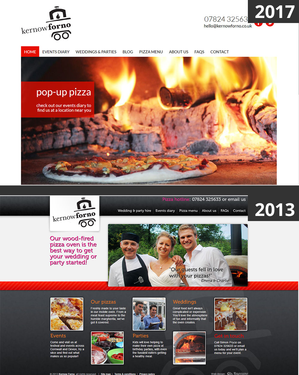
Kernowforno make the best pizza in Cornwall from their mobile wood-fired pizza oven, and we've worked with them ever since they started the business in 2013.
They wanted the site to look modern and appealing, so we designed them a site that was the current fashion in web design in 2013. There were lots of colour gradients, bold backgrounds, rounded corners, shadows and bright colours. We used Museo as the typeface, which was everyone's favourite font of 2013.
But fashions change quickly, and within a few short years, the website looked quite out of date. The new flat design movement did away with most of the design concepts that we'd used on the website, and so the new site design is much more minimal with a "less is more" philosophy, letting the mouthwatering images of pizzas speak for themselves.
Simply Time
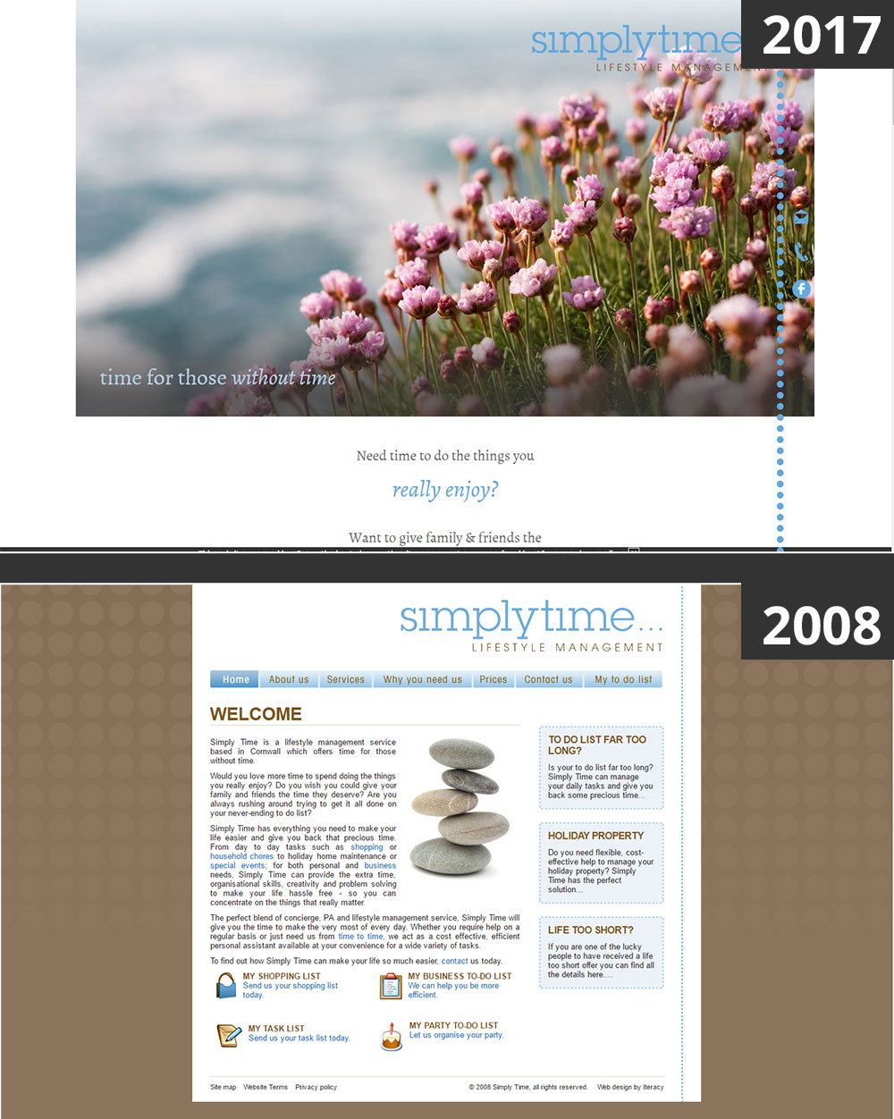
Simply Time was started by owner Kathy Ogg in 2008 as a lifestyle management business, and we worked closely with her to create a website that put across her personal touch. She chose the colours and the style of the site, and at the time she was extremely happy with the impression it gave of her business.
But again, over the years the site started looking tired and old-fashioned, so in 2016 we redesigned the site into a simple single-page website. Long single-page sites have become extremely popular as mobile use has increased, because it's easier to scroll down a page than to click on links to go to a new page. She was really happy with the new site as it reflected a number of changes to her business since it started.
We spoke to Kathy recently and sent her a screenshot of the old site for comparison. She replied:
"My initial reaction to seeing the old one was how dated and clunky was the old site and how lovely and fresh is the new one. Every potential customer uses the website to check that we are real, so they know what we look like. All our referrals used to be word of mouth but that is now changing to include checking online to see pictures of us! The new site really reflects us and the work we do now, rather than the old site which is what we thought we might do when I opened on day one!"
Treworgey
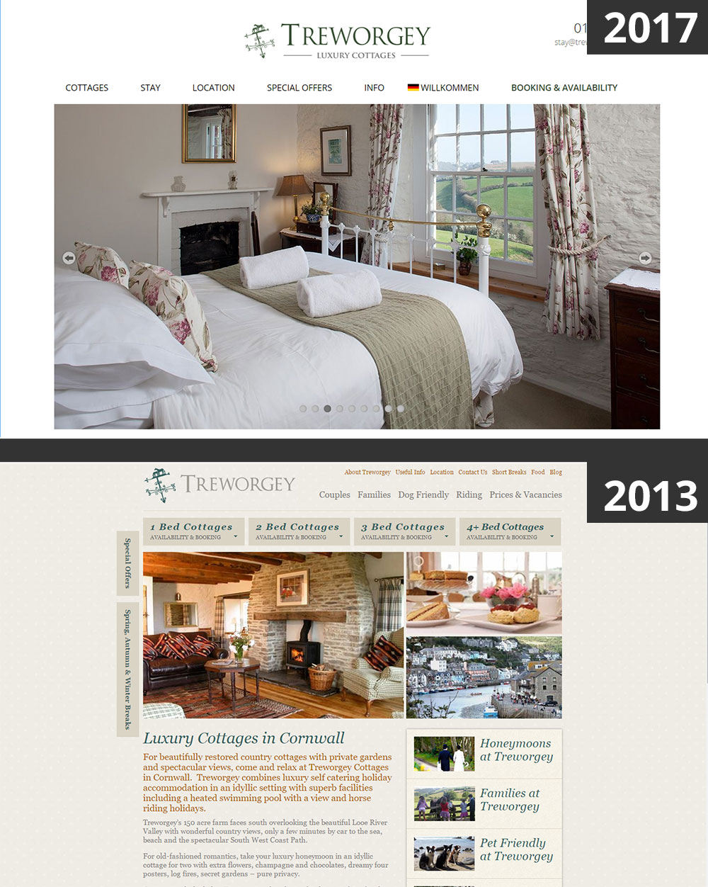
We were chatting with Holly Kyte, manager of Treworgey Cottages, about how she feels their business has changed. She said that "our website has gone from an online brochure to our shop window that attracts potential guests by giving them a ‘feel’ for our business at a brief glance."
One part of this process was making the website much more image-heavy and reducing the number of pages and the amount of text on each page. We've also made the website responsive across all screen sizes and devices because as Holly says "the whole process from attracting guests to taking payments to communicating with them has all moved online with the majority of our guests now dealing with us through their phones".
The website also has a growing section in German to appeal to this market segment specifically. Holly says that "Of all aspects of our business, our interaction with the Internet has probably been the single thing that has transformed the most in the last decade" and part of that has been promoting the business overseas.
Iteracy
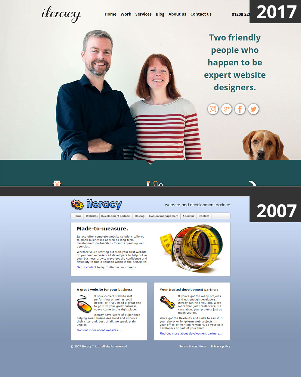
We'd like to end with our own website! When we started the company in 2007, we already had a lot of experience building websites - Mat built his first commercial website in 1997. But we didn't know what kind of business we wanted to be, and we didn't really know who our clients were going to be.
Our first website, shown here, was pretty bland. At the time we thought it was important that we project a big, corporate personality, with no photos of the two of us because we were worried that clients wouldn't want to use a small company.
Over time our website has become more personal and increasingly features us as real, friendly, people. We've come to realise that we are the biggest selling point of our company. Almost every one of our clients was introduced to us by an existing client, and so our pitch meetings, in other circumstances quite a high-pressure and stressful event, are always warm and friendly.
We sometimes joke that half of our clients don't even know the name of our company, they just refer to us as Mat and Kat, and we love that.
If there's one thing we've learned from a decade in business, it's that being friendly and honest is the most important aspect of a business relationship and one that clients value above all else.
Tagged under: Build a better website Design Responsive design 10 years of Iteracy