
Data visualisation
Written by Kat
While Mat has been engrossed in virtual reality, I have fallen down a less glamourous (but in my opinion, just as cool) rabbit hole of data visualisation. While that particular rabbit hole may or may not end up bearing fruit, to thoroughly mix my metaphors, it has caused me to reflect on the way that - with creativity and the right tools - data and statistics can engage, inspire and educate people or be a dangerous tool for misinformation.
Awesome data communicators
The best data analysts are the ones who are also fantastic communicators. I'm a big fan of Mona Chalabi, the Data Editor at The Guardian US. She creates hand-illustrated data visualisations, often focussing on gender and racial inequality. Here are a few examples:
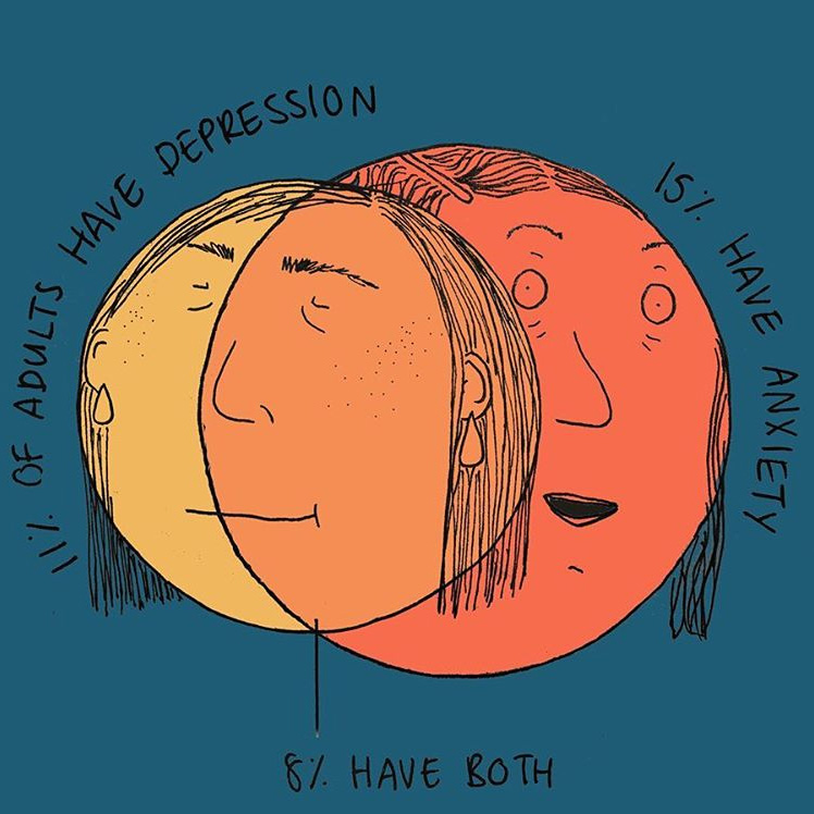
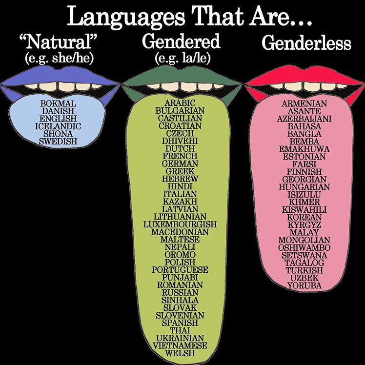
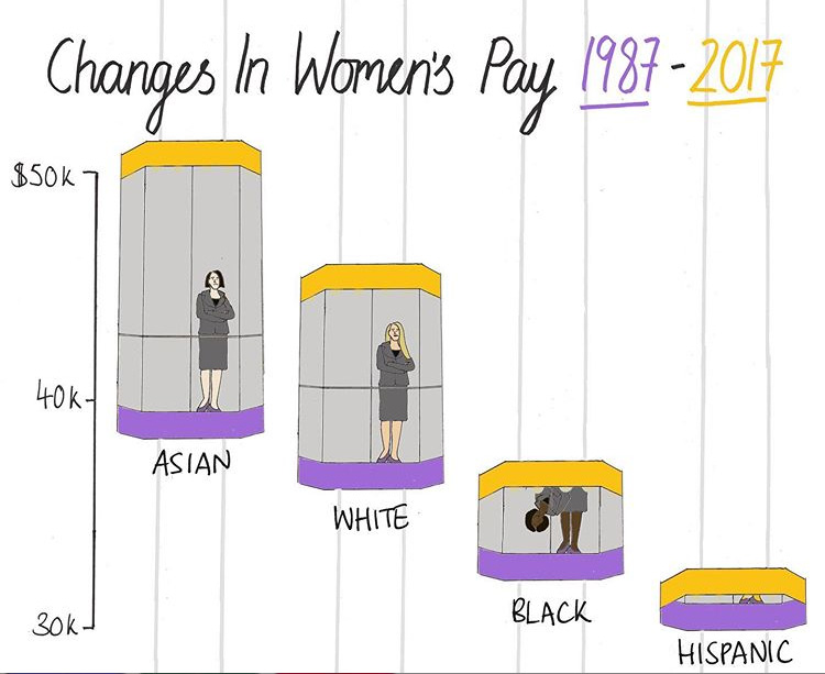
Who said maths can't be creative? (Admittedly statistics are very often creative but in other ways).
The late Hans Rosling is another well known, popular data analyst. The Swedish academic developed software that shows trends in data over time. He recorded a number of TED talks and BBC documentaries where he brought to life figures from the UN and World Bank, debunking myths and preconceived ideas about health, poverty and demographics in the so-called "developing world".
Gapminder, the foundation that Hans started with his son Ola and daughter in law Anna, continues to produce videos that make the world understandable through statistics. Google bought Trendylzer, the technology behind Gapminder, and launched a public data explorer so you can create and share charts generated from official data sources.
Unreliable data
Of course data can mislead as well as inform. Tyler Vigen's Spurious Correlations demonstrates perfectly that correlation does not equal causation with his simple graphs of apparently similar trends:
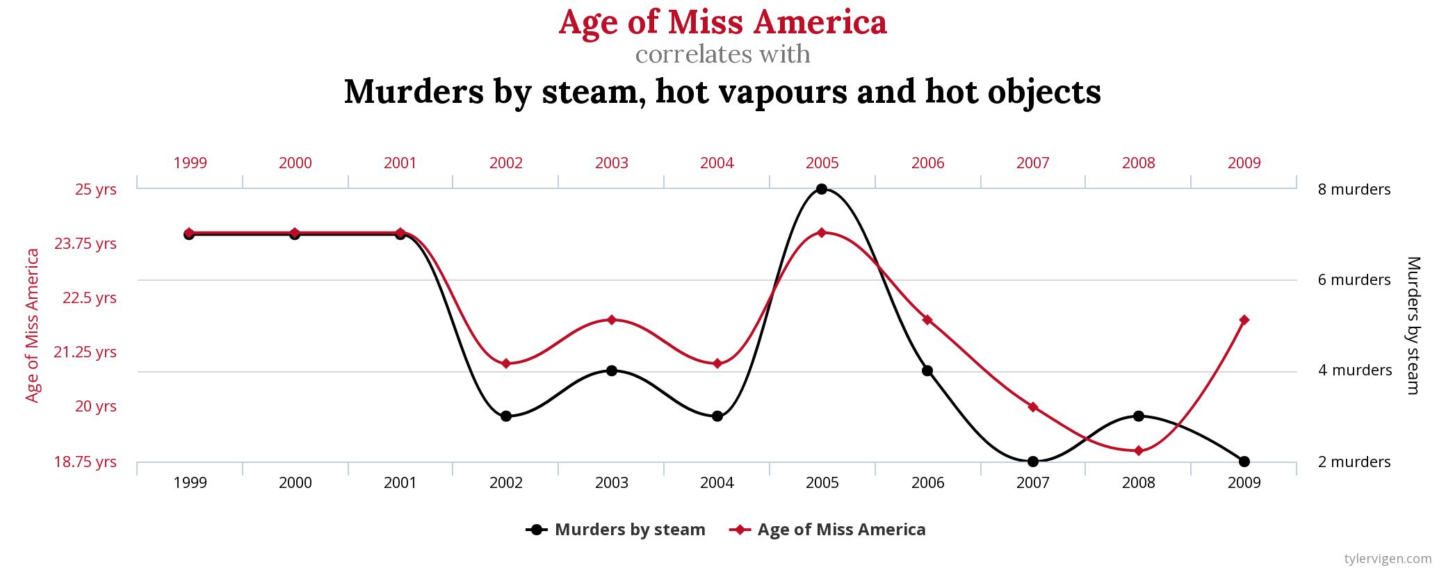
It's important that any kind of graph, chart or data visualisation should use and cite reliable and relevant data sources. Inaccurate, incomplete, outdated or misused data can have serious real-world consequences when it forms the basis of policy or decision-making.
Picking the right chart
Assuming your numbers are correct, the next step is to find the best way to represent them.
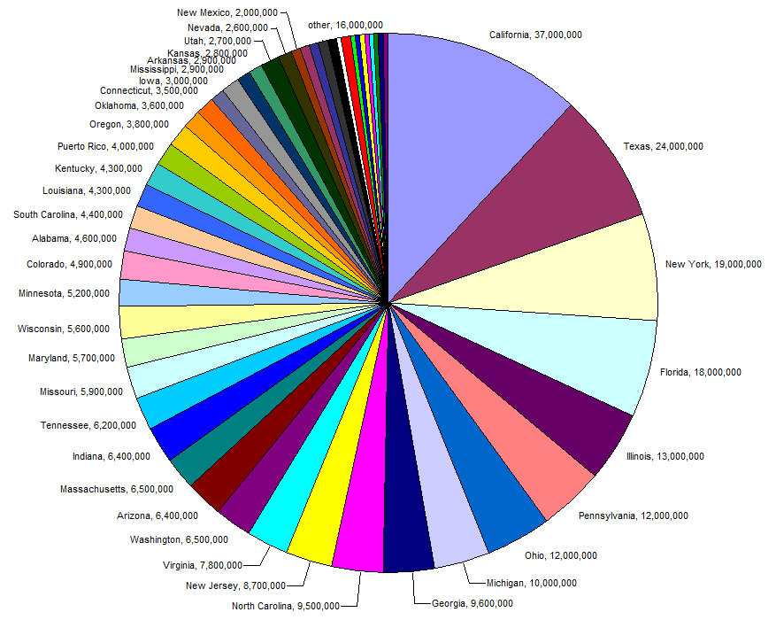
People â¤ï¸ pie charts. In certain circumstances they are fine, but in many others they are confusing or misleading as this post about some of the problems with pie charts explains. Apart from being a design nightmare in terms of colour combinations, the pie chart below is difficult to read because there are so many slices and it's impossible to tell the difference between similarly sized slices.
A plain old bar chart would be much better in this scenario.
Even relatively simple charts can become more interesting and informative with interactive or animated elements. Google has a gallery of charts available for data visualisation.
¡Animo!
Animated charts are particularly effective when showing trends over time, for example in this BBC article about the effects of climate change in 7 graphs.
Here's an example of an animated graph showing Mat's Fitbit activity and sleep data over the last 6 months (of course he records all his data!) Click the button to see the charts animate between sleep and activity data. This chart was made using Google's animated chart library.
It takes up less space on the screen to show both data sets on the same graph and it's more interesting for viewers to toggle between the figures.
Conclusion
People don't generally get excited about lists of numbers but they do like pretty pictures and moving things. Used well, data visualisations can be an engaging way of telling a story or illustrating a point. They can fun and funny, hard-hitting or inspirational. As long as data is accurate, relevant, up-to-date and clearly presented, graphs and charts can be powerful tools - just think twice before using a pie chart.
Tagged under: Data