
What is responsive design?
Written by Mat and Kat
Responsive design means creating web pages that adapt to different devices.
Before smartphones and tablets became popular, web designers created fixed width pages that worked on the most common screen sizes - usually 1024 pixels wide by 768 pixels high.
This all changed around 2013 with the massive increase in iPhone use to browse the web.
Mobile design challenges
Most tablets are able to display non-responsive web pages without any problems, but mobiles have several challenges:
- Screen shape - most smartphone users hold their phones vertically, in portrait mode. This means the screen is taller than it is wide, the opposite of a desktop computer.
- Screen size - smartphones have very small screens compared to desktop computers, so designers need to make the pages simpler.
- Low bandwidth - mobile users on a cellular connection will often have internet speeds comparable to home/office internet from the early 2000s. A 3G connection is about 5Mbit, and even a 4G signal is only 15Mbit. Many home connections are now 50Mbit or higher.
Responsive to the rescue
Responsive design meets these challenges by allowing designers to tailor their web pages to different devices. There are two main concepts that we use:
- Fluid layouts - these web pages scale smoothly from a desktop computer size down to a mobile browser. This is technically more complex because it requires the page to look good at any conceivable size
- Multiple layouts - this is a simpler version where different designs are created for the most common screen sizes, e.g. large desktop computers, smaller laptops and iPads, and mobile devices in portrait mode. There may be an intermediate size for iPads in portrait mode.
Our responsive designs
We tend to favour multiple layouts for cost reasons. Our responsive websites typically come in three sizes, detailed below using Cornwall Healthy Schools as an example.
Large desktop computers
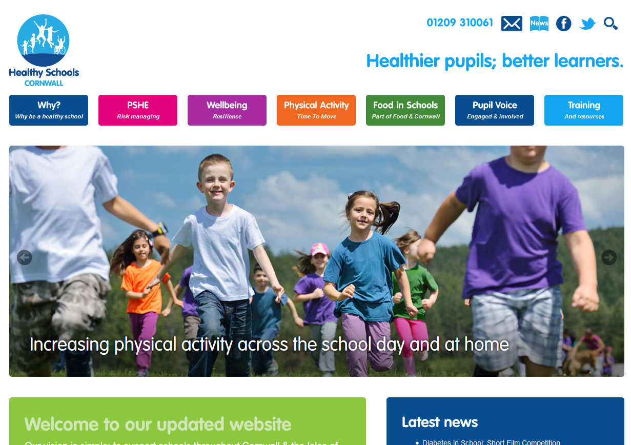
The desktop layout is 1200px wide and so will fit desktop computer screens (typically 1366px by 768px or larger) as well as larger laptops. The design sits in the middle of the page, with white space to the left and right.
Laptops and iPads
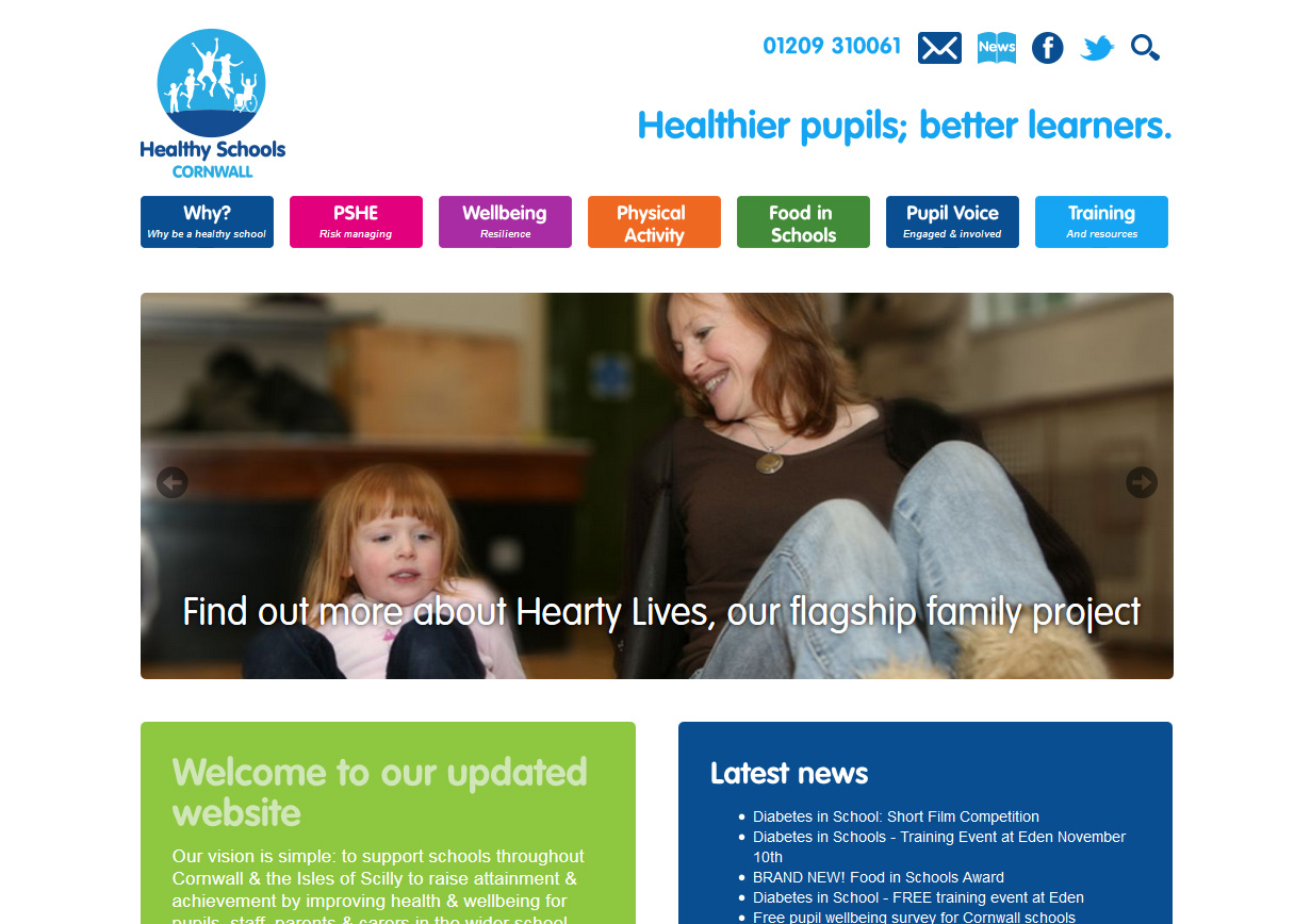
The iPad layout is 970px wide, which fits nicely onto an iPad screen in landscape orientation with a little white space to the left and right. This design also fits smaller laptops and older computers with a screen size of 1024px by 768px. It is also displayed to smartphones in landscape orientation.
This layout has exactly the same functionality as the desktop layout, but everything is scaled down to fit a smaller screen.
Mobile devices
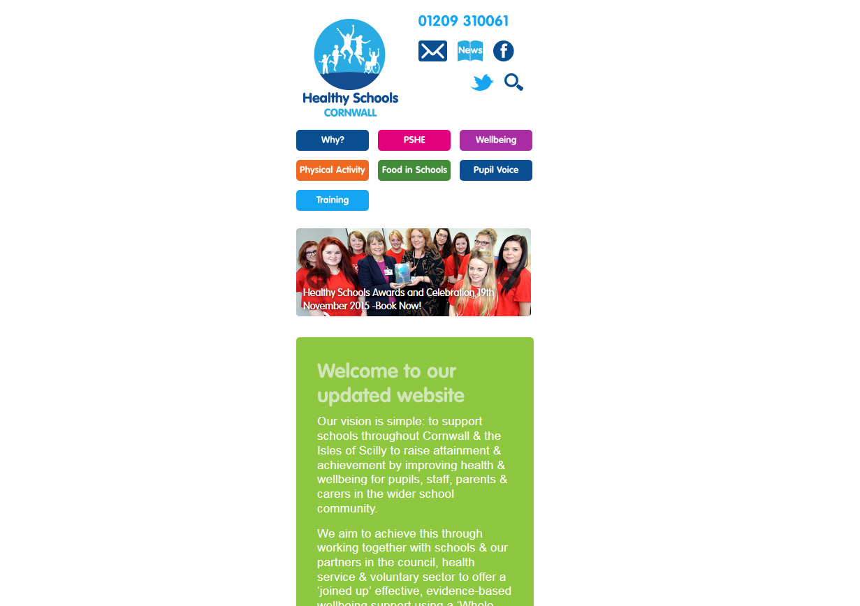
The mobile layout is designed to fit iPhones and other smartphones in portrait mode at 340px wide. As you can see, there are some layout differences and the functionality is often simplified to allow users to interact with the website using their fingers - buttons are usually larger. The website often features pop-up navigation - although this one doesn't.
Tagged under: Bluffers guide Build a better website Design Mobile Responsive design