
The creative process and logos
Written by Mat
In a typical year, we design and build 10-20 websites, each one designed from scratch to meet the needs of the client. One of the parts I enjoy most is graphic design. This usually starts with a call or a face-to-face meeting with the client, where we get to know each other and we learn about what they do. We'll have a conversation about styles and websites that they like and don't like, their preferred colours, and we'll look at relevant photos for inspiration. Discussing websites that the client doesn't like are an essential part of the process because they can help us avoid making the same mistakes!
Case study - Penwith Landscape Partnership
As an example, I'll use our recent logo design for Penwith Landscape Partnership. We met up with the team in February to talk about the website and agreed that we'd create a logo and branding for them as part of the work. The website is a virtual museum for the Penwith area of Cornwall, the very western end of the county from Penzance across to Lands End.
Penwith is a wild part of Cornwall, windswept from the Atlantic ocean and with a very different feel to the rest of the county. We've visited the area many times over the years and it has a special place in my heart. The community has a strong identity, and we wanted this to come across in the logo.
Colours
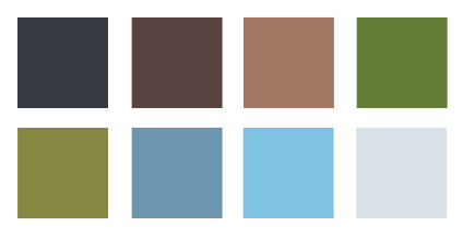
At the meeting we talked about the unique colours of Penwith - the north coast is very rugged with slate rocks and a petrol blue sea, flecked with white. The inland regions have distinctive fields of moss and sepia (not literally), with bronze and burnt sienna recently-ploughed land showing the unique geography of the area.
I looked at dozens of photos to find a set of eight colours that represented the Penwith landscape. For more information about choosing colours see my recent post on this topic.
Concepts
The first part of the logo design process was to create three concepts - sketches of different options for look and feel. Each concept had its own style, typeface and colour palette. This allows the client to involved in the design, by mixing and matching elements into something unique that belongs to them.
Concept 1
The first concept was based on a photo I took many years ago on the north Cornish coast, near the Gurnard’s Head. I began by tracing outlines of the photo in Adobe Illustrator, then simplifying the shapes and removing detail to make it more stylised.
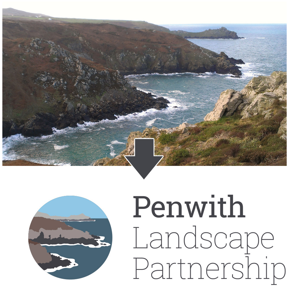
In this concept, the logo is enclosed in a circle - I tried extending the land out beyond the circle but it didn't quite work. It's a serious palette with mainly dark colours. To lighten the tone we used the font Roboto Slab, which is quite a friendly font with open curves.
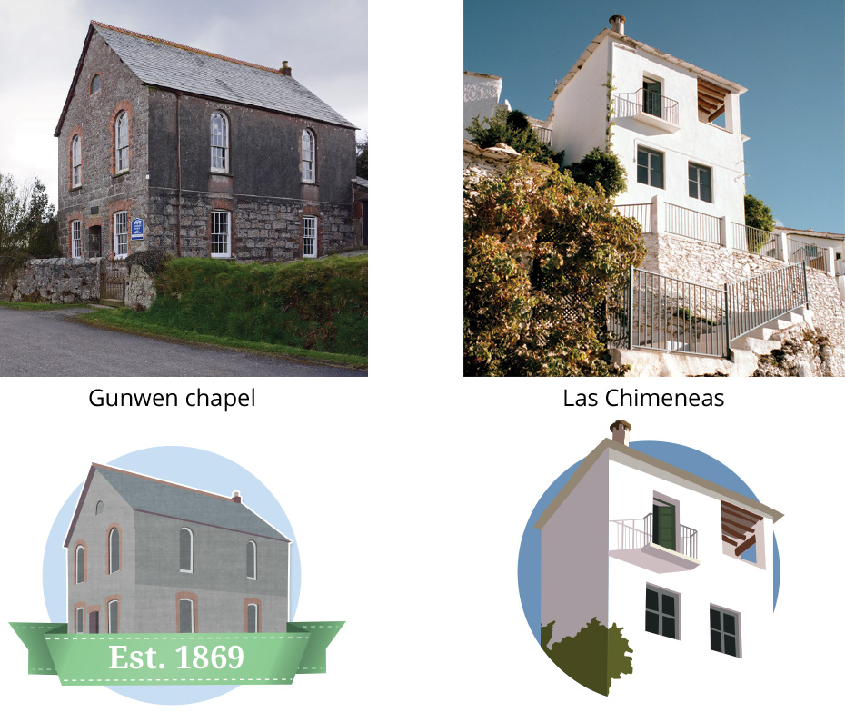
We've used the process of drawing photos as logos for Las Chimeneas and Gunwen Chapel:
Concept 2
For the second concept, I wanted to create a logo that was more abstract, representing a fictional view across fields to the sea. I spent many hours flying virtually around the landscape in Google Earth trying to find the right place - I found it near Lower Bostraze looking west towards St Just. Google Earth allows you to exaggerate the height of the landscape, which gave it a more aesthetically-pleasing view, and I drew and re-drew the view several times to simplify it.

For the palette, I chose the warmer colours of Penwith in the summer. The icon is square with rounded corners to soften it slightly and uses the Copse typeface, which is a bold and friendly font that has an almost hand-written appeal.
I used this similar technique to create a logo for Tamar Psychotherapy many years ago, based on a view looking south down the river Tamar near Plymouth:

Concept 3
The core of the website is mapping so for the third concept, I wanted to create a logo based on a map. When we were arranging the meeting with the team at Penwith Landscape Partnership, I checked their location on Google Maps and spotted a beautiful patch of newly-ploughed fields just to the north of Lands End airport. I traced the outline in Illustrator, picked a suitable palette from the colours of the fields, and redrew it to look like a paper map spread out on a table.
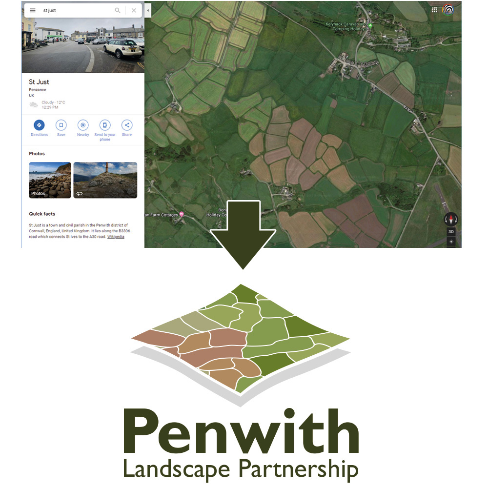
The logo shape is intentionally different from the first and second concepts to give the client choices. They had previously mentioned that they were keen to use Gill Sans in their design, so this seemed like a suitable choice of typeface. The form of the icon suggested placing the logo underneath, and so I experimented with breaking the type into two lines rather than the three on the previous concepts, again for variety.
The logo
The client came back with detailed and positive feedback - they like the icon from the second concept and the font styling from the third. We then created a series of four different styles for the first iteration of the logo. Each version had different sized and shaped logos, brighter and darker colour schemes and varied text placement.
 We then went through three more iterations of the design (we're called Iteracy for a reason!) trying out different options like raising the level of the sea, changing the text colour, and adding rocks to the tops of the hills to make it a bit more rugged and distinctively Penwith.
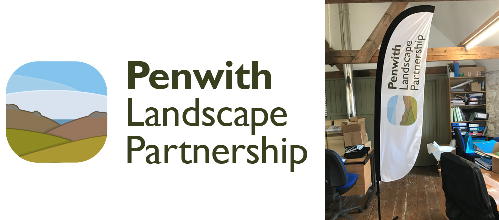
Here's the final approved logo, and how it looks printed onto a feather flag for use at their events:
In summary
I hope this has given you some insight into the creative design process. I find it an extremely rewarding and satisfying job. Each project for us is different and unique, and each demands a different approach to creating work of which we're very proud.
If you'd like to see more examples of our work check out our portfolio, or get in touch to talk about how we can help you.
Tagged under: Bluffers guide Build a better website Design