
The creative process and colours
Written by Mat
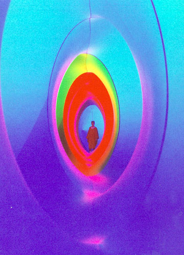 From a young age, I've been obsessed with colour. I've always been drawn to colourful objects, one of the most memorable events of my childhood was visiting Colourscape in Salisbury in 1987. Shown here, my family wandered around inside a giant inflatable structure with colours so bright and vivid I thought they were going to burst my eyes. It's well worth a visit if it's near you
I've never really liked black and white photography, or movies because I think they're lacking so much of the beauty of the world. It can be used to good effect in films like Schindler's List, but black and white images don't feel real to me. I've just finished watching a series on Netflix called World War II In Colour and it makes the events seem so much more immediate.
Colour is a really important part of graphic design, and so I wanted to share some theories, tools and techniques we use to choose colours for our work.
Colour theory
Colour theory is an entire subject in its own right, going all the way back to Isaac Newton's first descriptions of the spectra that he saw when shining sunlight through a glass prism. If you find it hard to distinguish blue, indigo and violet as three separate colours in a rainbow you're not alone - it's believed that Newton chose seven colours to fit with the seven notes of the musical scale rather than because that's how many he could identify.
Most humans can distinguish around seven million colours using our three colour receptors (red, green and blue), but some animals like the mantis shrimp can see all the way from the deep ultra-violet all the way up into the far red (and even polarised light) using their 12-16 different types of colour receptors. Listen to the wonderful Radiolab podcast on colours for more details.
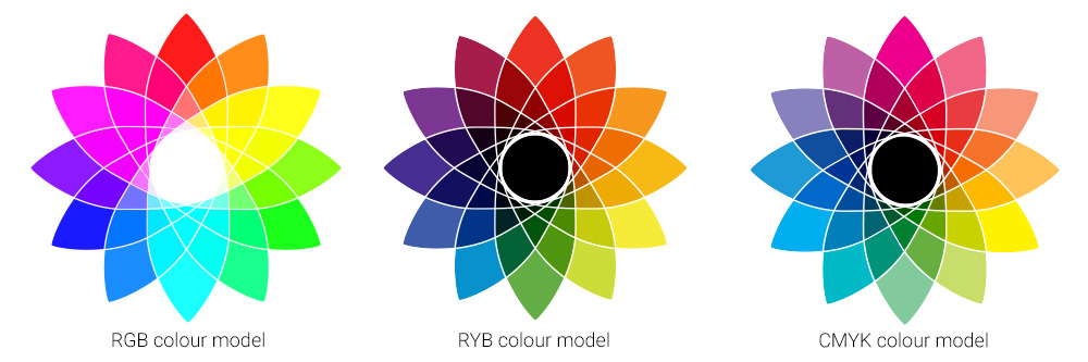
There are lots of ways to model colours, but the three most common are Red-Green-Blue (RGB) used in computer screens, Red-Yellow-Blue (RYB) used by artists and in most theories of colour, and Cyan-Magenta-Yellow-Black (CMYK) used in print. Note the difference between RGB where adding all the colours together makes white (called additive) and the other two where it makes black (called subtractive). RGB also has a much wider range of colours that it can display, which is called the gamut. All of these colour models have a much smaller gamut than the range of colours that the human eye can perceive.
Simple colour schemes
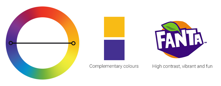
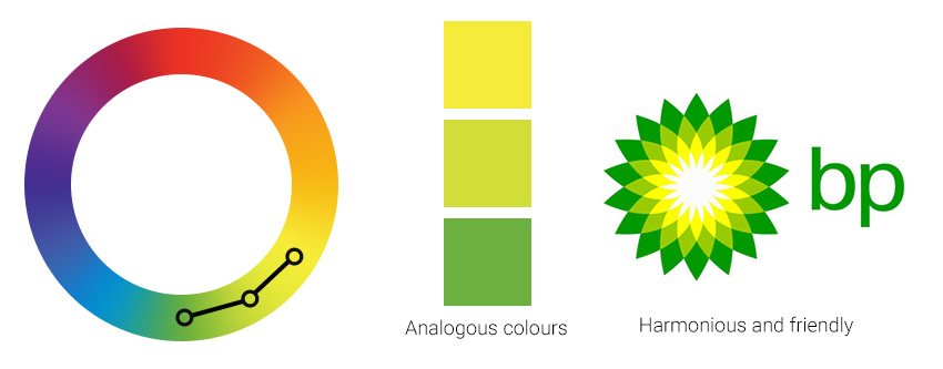
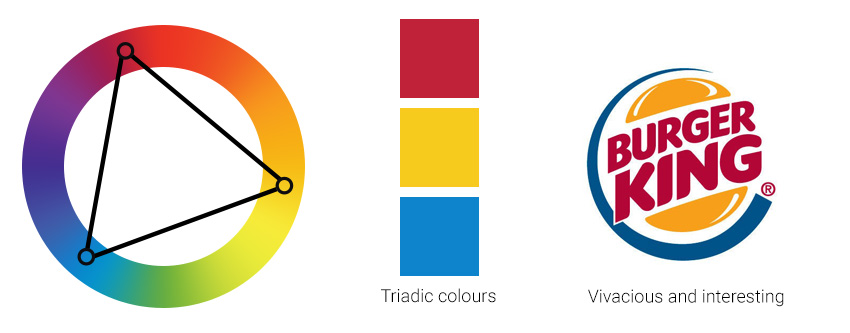
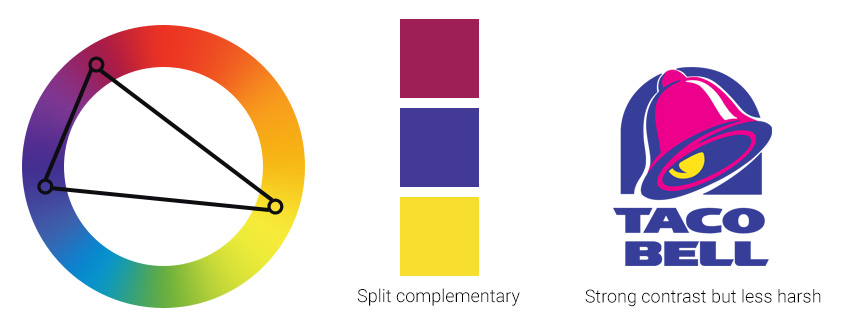
Colour theory provides some simple schemes for how colours complement and harmonise with each other. They work by placing geometric shapes over the colour wheel and can be used to create a range of moods.
These range from complementary which gives a high contrast between the two colours, analagous which is a more harmonious scheme, triadic which is also high in contrast and works best with one main colour and two secondary colours, split complementary which is often described as having less tension than regular complementary, and tetradic which often also has one dominant colour.
Websites like Paletton let you create palettes based on these schemes.

Colour lovers
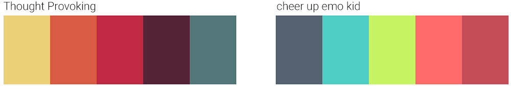
One of my favourite websites for picking colours is COLOURLovers. They have over a million user-submitted colour palettes and the search allows you to narrow that down in helpful ways. Two of my favourite palettes at the moment are Thought Provoking and cheer up emo kid. We very rarely use an entire palette for a project, preferring to take colours from a range of palettes or use them as a starting point to create our own.
Picking colours from photos
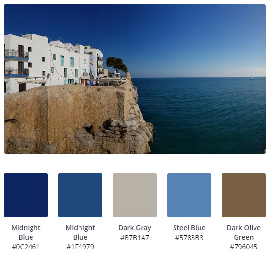
This is a common technique that we use to find colours for a palette. When we met with the owner of the Old Post Office to discuss building her website, she had a nice blue and brown tablecloth on the table where we sat. I snapped a picture and used it in the colour scheme.
I'll sometimes start with an image that is completely unrelated to the project we're working on, but which contains nice colours. The finishers of a particular running race here in Valencia last year received a wonderfully colourful t-shirt from which we used colours to create the backgrounds for the Animo Flute and Piano Duo website.
The stripes on an old version of the Healthy Gay Cornwall website we run for Cornwall Council came from a napkin that we bought in Habitat! I have a whole folder full of images that I think will make nice colour schemes that I have yet to use.
Picking colours can obviously be done by hand in a tool like Photoshop, but lots of websites exist to help choose palettes, such as Canva:
I Love Hue
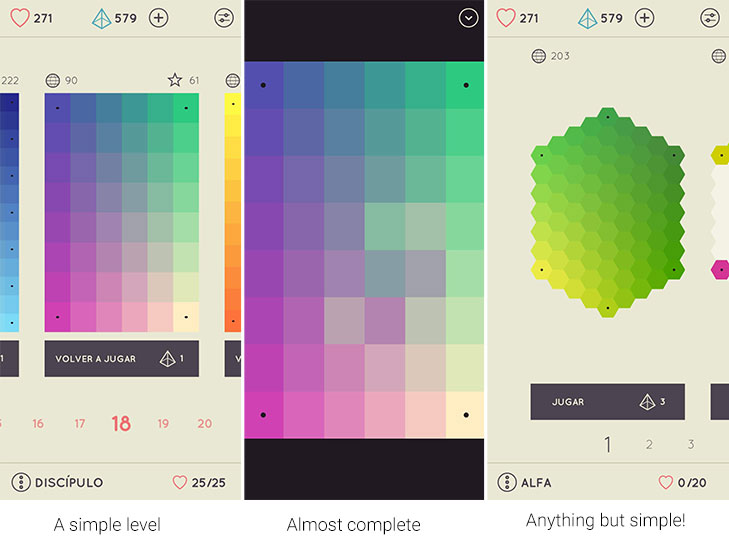
A while ago I found a game that could have been tailor-made for me: I Love Hue, described by its developers as a gentle journey into colour and perception. As well as being intensely relaxing, I find it a great source of inspiration for colour palettes. Play is on a board made of tiles of varying gradients, which are randomly jumbled. The player has to move pieces to the original gradient.
The early levels are fun and beautiful, but the game gets extremely hard once the gradients are more monotonal.
There are two more important considerations when choosing a colour palette: colour blindness and cultural differences.
Colour blindness
The most common form of red-green colour-blindness affects around 8% of European males and 0.5% of European females, these numbers vary a little across ethnicities.
The board game Trivial Pursuit is famously difficult for colour blind people to play, as this example shows:
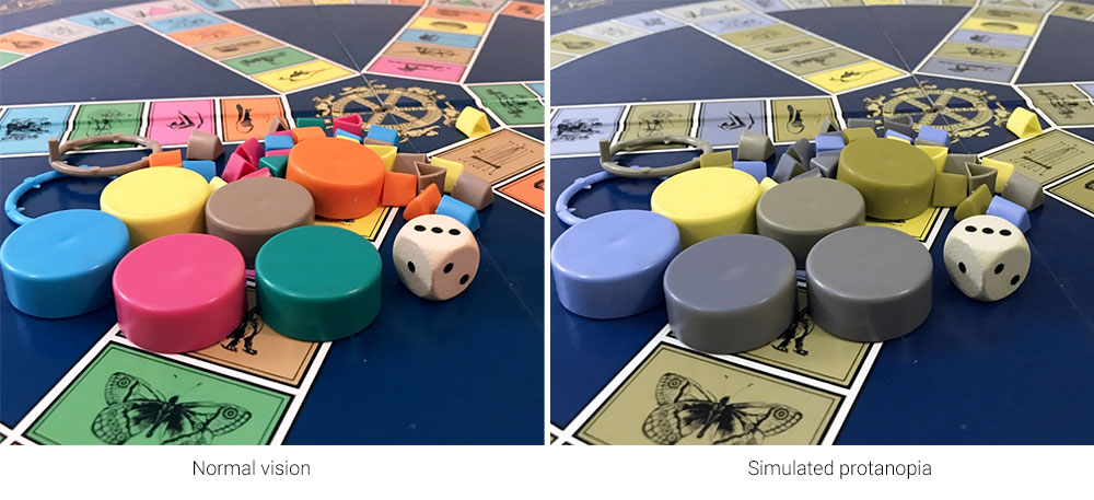
There are many tools such as the Color Blindness Simulator to help you spot possible problems with your designs before they go out into the real world, and Photoshop has a feature built in to simulate two of the most serious kinds in the View -> Proof Setup menu.
Cultural Differences
A last and very important consideration is the cultural values associated with a particular colour. For example, western cultures see red as a colour of passion, excitement and danger, while eastern and Asian cultures often see red as the colour of happiness and luck - red wedding dresses aren't uncommon in some areas, which would look very strange to most Europeans. Orange makes most Americans think of Hallowe'en, but this is a sacred colour among some Asian religions. In Thailand yellow is the colour of the king, whereas in Latin America this colour is associated with mourning. I could write a whole blog post just about cultural differences in colour appreciation!
Knowing your audience is critical and can make a big difference in the success of your project.
Summary
I hope this post has given you a new appreciation for colours, how they combine, where to find inspiration, and how important it is to choose the right colours for your project.
What's your favourite colour? Get in touch and let us know!
Tagged under: Build a better website Design Accessibility Marketing Games