
Open Data
Written by Mat
Open data, the less famous cousin of open source, is the idea that the world is a better place when information is freely available.
It's not a new concept, scientists have been sharing data for years, and governments have always published summaries of data like censuses.
The big change in the last ten years has been towards sharing much more data and, crucially, formatting that data to be machine-readable. This allows people to study data sets and produce some stunning visualisations. We want to show you three examples of open data at the global scale, country scale and city scale.
Global scale
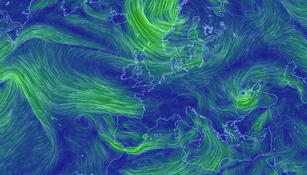
The most beautiful example that we've seen recently is earth - a visualisation of global weather conditions created by Cameron Beccario.
It takes open data from a wide variety of sources including supercomputer weather simulations, and uses it to create an interactive map of Earth.
As well as being beautiful it's also incredibly detailed, if a little tricky to navigate.
The default view shows wind speed at the surface, but it's possible to view the wind speed at varying heights. Click the little menu icon the bottom left corner, and click through the Height options and you'll see the wind speed at increasing heights above the surface.
We've spent many hours learning about the climate through this incredible tool.
Country scale
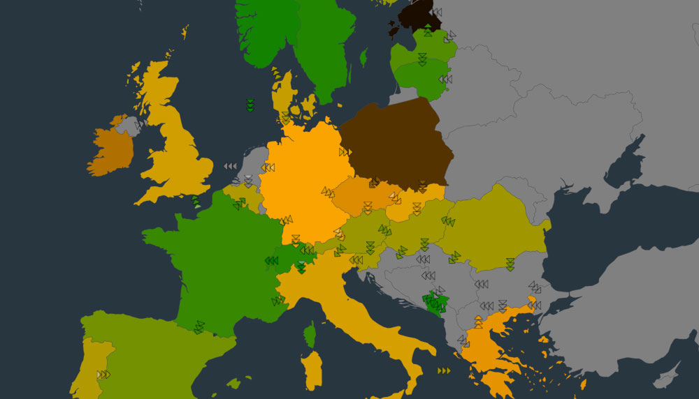
Not quite so beautiful, but just as interesting is this European electricity map by Tomorrow.co.
It takes live electricity generation and supply data for a 20-something European countries and displays their data in an easy-to-understand format. It's very detailed so it's best viewed on a computer with a big screen, rather than your mobile.
It shows how much electricity is being generated by different methods for each country, as well as electricity import/export to neighbouring countries. What's incredible here is that all of these countries are producing live open data about their electricity generation and distribution systems in real time. There are some more technical sites that display this data, for example Grid Watch in the UK and REE in Spain.
This site has become one of my daily visits, to see how my electricity is being generated today.
City scale
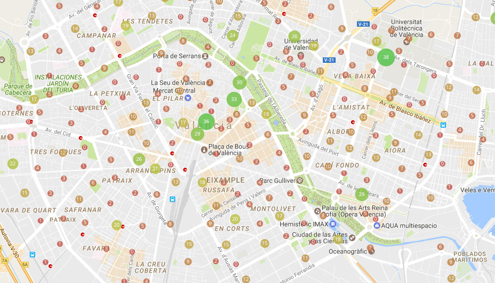
In Valencia, Spain, the government runs a city-wide bicycle hire scheme like London's Boris Bikes, called Valenbisi.
For an annual fee and a small hourly charge, people can pick up a bike from one of the 300-ish hire stations around the city, and return it to any other station they like.
Each station has 20-30 spaces for bikes and in total there are some 3,000 bicycles. It's a great scheme and allows us to live here without needing a car (which is presumably the whole point).
But sometimes we find it frustrating because some evenings we can't find a free bicycle at a station anywhere near where we live, in the very centre of the city, and once we've got one it can be hard to find a free space at a station at our destination in the suburbs.
So we thought we'd use the power of open data to visualise what's happening - here's our Valenbisi usage map.
First of all, we obtained a week's worth of data from the Valenbisi website by downloading the data every half hour and saving how many bikes are available at each station.
Then we fed this data into Google Maps and created icons showing how many bikes are available at each station - a large green blob shows a lot of bikes, and a small red blob shows a few. There are numbers in the centre of each spot that show the exact number. Finally we animated the data and the answer became obvious.
There's a general trend of bicycles moving into the city between 7:00 and 9:00 each weekday morning. These move out of the city again from lunchtime onwards, and by early evening most of the bikes have moved back out into the suburbs.
This makes sense because of the general flow of people, but also explains our problem! The biggest users are commuters bringing bicycles into the city during the day and taking them away again after work.
But it also highlighted stations near us that tend to have bicycles in the evenings, such as one location in the central square. So from now on we'll be looking for a bicycle at that station when we want a bicycle in the evening.
Conclusion
Hopefully these examples have given you some ideas about great ways that your organisation could make information publicly available and contribute to open data.
If you're keen to make your data open and want us to create some visualisations of that information, get in touch today.
Tagged under: Build a better website Hot topics Design Open data