
Usability and Flat Design
Written by Mat
Usability, put simply, is how easy it is to use your website. It's one of those concepts that sounds basic but actually requires a lot of experience and thought to get right.
When we design websites, usability is always at the top of the list of requirements. If visitors can't use your shiny new website, then you're not going to get their business.
Flat design
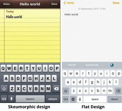
One of the big fashions in web design at the moment is flat design. It's the look of the iPhone operating system, the look of Windows 10. Colours are flat, and interface elements like text boxes and buttons are plain rectangles with minimal visual cues - no shadows, no textures and no colour gradients. It's a response to the old Skeumorphic design of the iPhone, for example where the Notes app looked like a physical notebook.
Compare and contrast:
There's a very in-depth piece on the history of iOS here if you want to learn more about how it's evolved.
Flat design is great for a number of reasons: it's clearer, its simplicity works well on mobiles, and it's faster to load over a slow internet connection.
Flat design slows down visitors
Where it doesn't perform well is usability though. Coming back to the Notes app above, in old style on the left it's easy to spot where the Notes and Done buttons are, because they're outlined and shaded, although they fade into the top bar a little. In the flat style on the right there's just colour highlighting, no box and no shading.
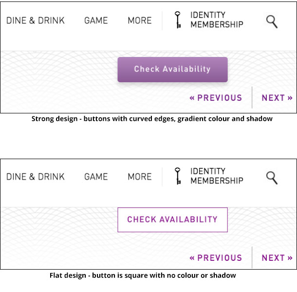
In a big study last week, Neilsen Norman Group showed that flat design elements slow down user interaction. They took identical website designs and tweaked them to make one more "flat" than the other. Here's an example of flat design in the Check Availability button on one of their test websites:
They tracked how the subject's eyes moved on the page and how long it took them to perform tasks like finding a particular item on the page.
They found that on average, flat design elements slowed down user interaction by a whopping 22%. Your visitors might take 22% longer to find a link to Buy Now, or 22% longer to find your phone number. That could equate to fewer contacts and sales through your site.
In addition, they found that users had 25% more fixations on the flat design - their eyes looked at 25% more elements on the page. They struggled to find the items they were looking for. Weak design wasted the users' time.
Good usability
This shows how critically important good usability is. It literally translates into more money / engagement / success for your business. The study ends by concluding that websites need to follow "basic UX design best practice: visual simplicity, external consistency, clear visual hierarchy, and contrast."
This is what we always strive for in our designs. Our philosophy will always be to put usability first and make sure that your visitors can find what they're looking for, quickly and simply.
Tagged under: Build a better website Hot topics Design Responsive design Accessibility