
Anatomy of a web page 2022
Written by Mat
Introduction
Great web design is all about usability - if your customers can't find their way around your website then they're going to leave pretty quickly. Among other things, usability means having an intuitive and consistent structure to your web pages. In this blog post we're going to break down some real websites that we've built over the years and show why we, as web designers, choose to design pages in a certain way.
For each example image, we're highlighting the relevant area in a dashed red box. Click on any of the images to view the live websites to get a better understanding of the feature.
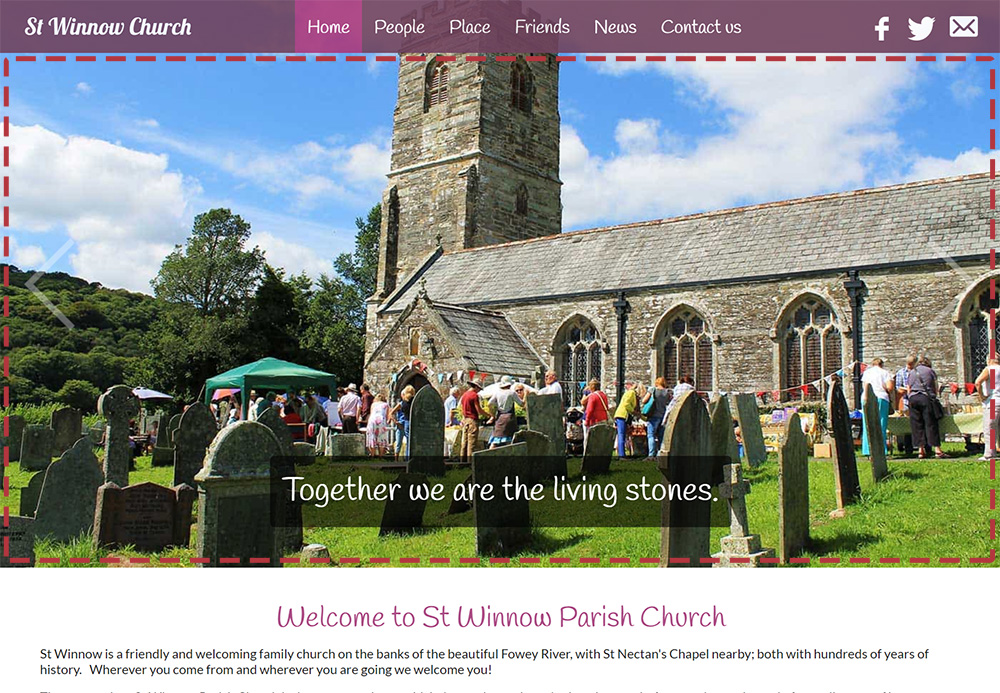
Header
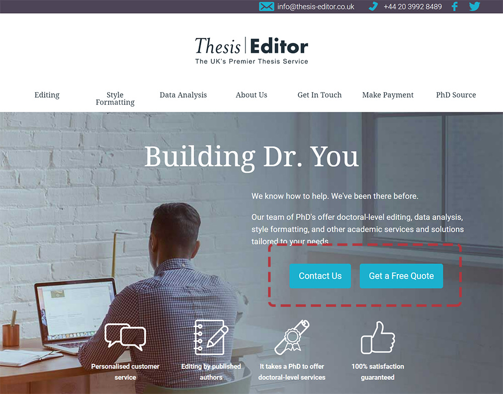
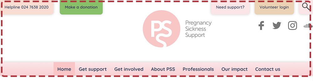 The header refers to the top of the page, typically everything down to the main navigation of the site. Because it's at the top of the page, it's always the first thing that your visitors will see when the page loads, and so it needs to clearly identify your website, the visitor's location within the site, and usually links so that they can contact you - by email, phone or social media. For visitors coming to the site for the first time, your main navigation items will give visitors a sense of the most important parts of your website.
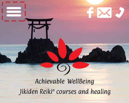
Your header will need to change size and shape between different devices, but it should look the same so that a visitor who previously visited on their phone is reassured when they come back on a laptop and recognise the style of your site. A lot of websites use "sticky" headers that get smaller once you start scrolling down the page, but stay stuck to the top of the screen for easier navigation.
Logo
Your logo is the most obvious way to identify your website, and it's common to place it either on the left side of the page (in languages that read left-to-right, like English) or in the centre of the page. Placing it in the centre makes the site feel more balanced, but can look very busy if you have a lot of other features in your header. The logo should be big enough to draw attention, but not too big so that it dominates the header. Most visitors expect that clicking on the logo will take them back to the home page.
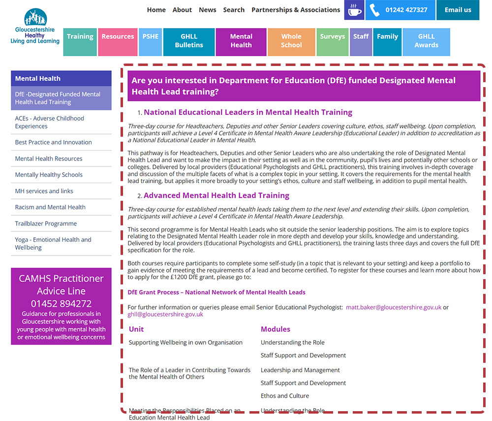
Navigation
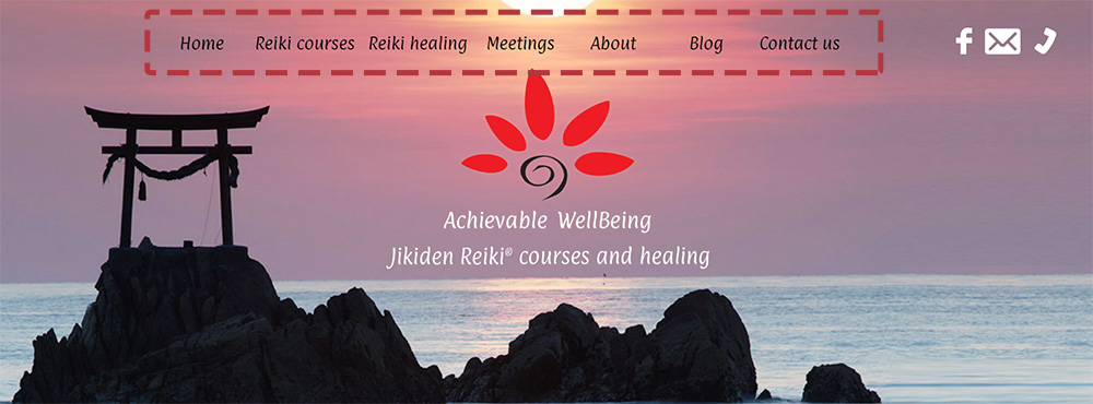
The website's main navigation is the bar of links that usually appears horizontally in the header, or a "hamburger menu" icon for mobiles. Navigation will frequently be in a bold colour to make it stand out, and rolling the mouse over a link will show a set of drop-down links that are called secondary navigation - pages within a particular section. For complex sites with deep structures, we recommend only showing one level of links - a lot of visitors struggle to use an extra level of navigation here, and in this case, we'd suggest vertical secondary navigation on the internal pages of the site to aid navigation (more on that later).
The navigation usually starts with a Home link. Studies show that people will look at navigation links on the left of the page more than those on the right (for left-to-right languages), so it's important to place the most important sections of your site on the left and work along to the less important sections. The one exception here is that it's become convention to put the Contact link as the last link in your navigation.
More studies have shown that the maximum number of navigation links that people can easily understand is between eight and ten, so try to structure your website so that you don't have more than this number of top-level links in your site structure. In a pinch, you can cheat slightly and remove the Home link, because most people know that clicking the logo will take them back to the home page.
Contact links

The header should include at a minimum a phone number and email address, both of which should be links that visitors can click to contact you. Some of your website visitors will much prefer to fill in an online contact form, but a good number will just want to write you an email, so be sure to include both options to encourage your visitors to get in touch. Your phone number(s) should be formatted in the international format, e.g. +44 1208 226522 and will be clickable so that users on mobile devices can call you with one click. To make it easier for your visitors, you might want to add little icons next to your contact links, and also include links to reach you on WhatsApp or other contact methods that are common in your sector. If your organisation relies on donations, this would be the perfect place for a big "Donate Now!" button.
Login popup
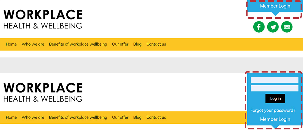
If your website includes a members-only area, the header is the perfect place to include a form so that they can log in. This is often hidden by default and pops up when the visitor clicks a button or link. This popup should also include a link so that members can reset a forgotten password, and a registration link to encourage new people to sign up.
Search form
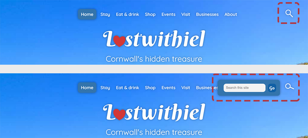
If your website has lots of information, your visitors might benefit from a search form. We usually recommend using the Google Site Search interface, which does a great job of indexing the website and allows complex searches. There is a cost associated with it, but Google give you a generous allowance each month before they start charging.
Social media
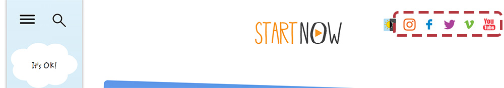
The header is also a perfect place to put your social media links, unless it's looking a bit busy in which case you might want to move it into the footer. The links you add here will depend on your industry - if you're a new recruitment startup then you'll want to link to your LinkedIn page, but if you run a self-catering holiday company then you'll want to link to your TripAdvisor page and show lots of lovely photos on your Instagram. It's tempting to include links to dozens of different channels, but try to keep it to four or five to avoid overwhelming your visitors.
Body
Scrolling down the page beyond the header, we come to the body of the page, which will be different on every page of your website.
Hero image
A hero image is an image that is used to represent the main topic or theme of a web page. Hero images are often used on homepages to give visitors a snapshot of what the website is about. They can be either static or animated, and can be used in a variety of different layouts. Hero images on the home page give a quick visual overview of what the website is all about.
Secondary navigation
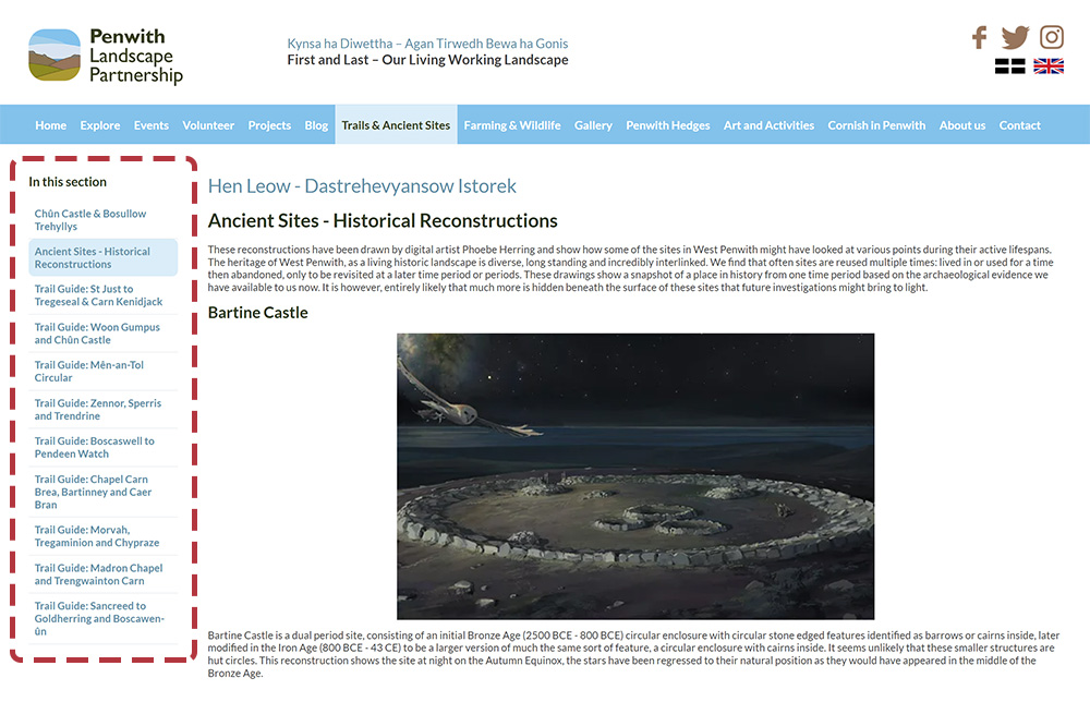
Secondary navigation is a set of links that are usually displayed near the top of the page, below the main navigation. These links can help users navigate to specific pages on the website, or to other areas of the website. For websites that have very complex or deep structures, the secondary navigation allows visitors to find pages that are buried deeper into the structure of the site.
Breadcrumb trail
A breadcrumb is a navigational aid that allows users to track their location within a website. The term comes from the Hansel and Gretel story in which the eponymous characters drop breadcrumbs to help them find their way back home. Breadcrumb trails will typically be at the top of the page, below the main navigation, and each item in the breadcrumb is clickable. So for example, the breadcrumb for this page could look like:
Home > Blog > Anatomy of a web page
Page content
Finally, we get to the actual content on the page! Different pages may have different layouts - a large single block of text, two columns side-by-side, a grid of text blocks. Mobiles will usually display complex layouts in a linear fashion to make it easier to read, so it's important to consider this when laying out your page and writing your text.
Calls to action
A call to action (CTA) is an instruction to the reader to do something, most commonly to buy a product or subscribe to a service. They can be text links but are usually large, bright buttons. It is usually placed either front and centre to maximise visibility to the visitor, or at the end of a longer block of content to lead the visitor into a specific action immediately after they finish reading your page.
Related pages
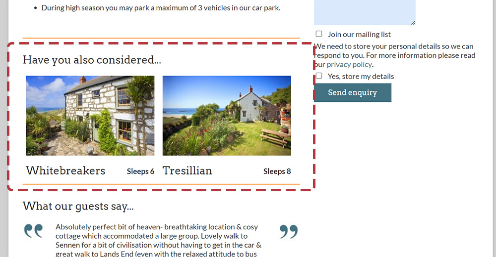
Depending on the content of your page, you may want to encourage visitors to look at related pages - this is most useful in an online shop or a blog post. This kind of feature can be automated as long as you have some kind of categorisation and can show different related pages each time a visitor returns to the page.
Footer
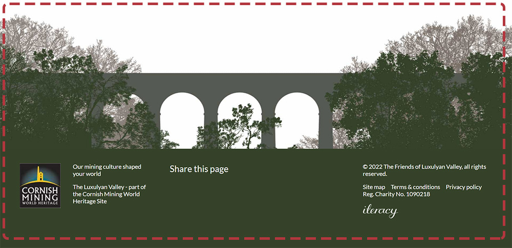
At the bottom of your page is the footer, which typically contains contact information for your organisation, a form to sign up to your mailing list, links to your social media channels and the usual copyright blurb.
Contact information
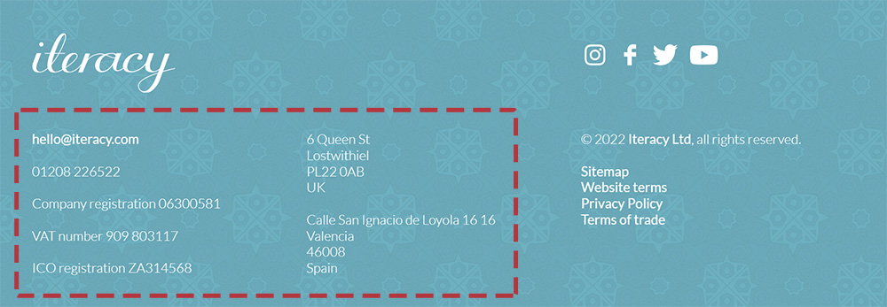
Depending on where you do business, it might be a legal requirement to include your contact information on your web page. In most cases you want your site visitors to get in touch anyway, so it makes sense to put at least your phone number and email address at the bottom of every page, using some method to hide your email address from spam robots. Most UK businesses should include their company registration number here too, or your charity registration number for charities.
Newsletter sign up
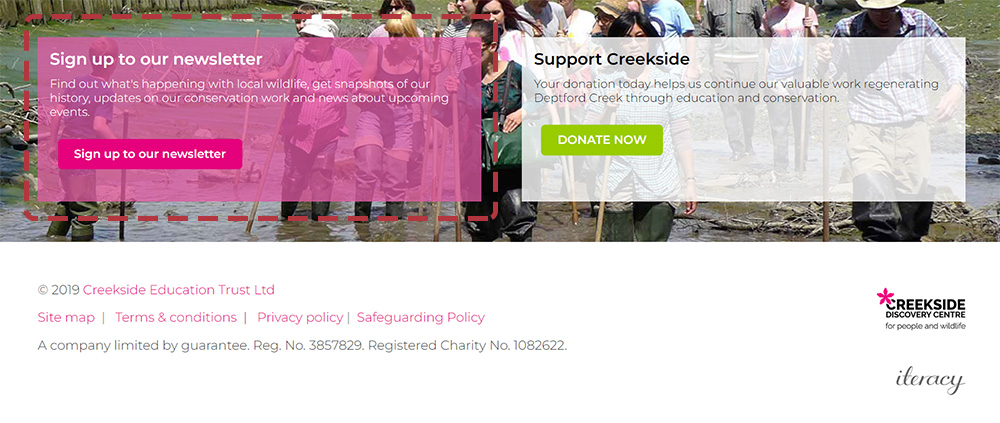
The footer is a great place to include your newsletter sign up form as an additional call to action. Try to keep the number of fields to a minimum to encourage people to complete it, and only their email address needs to be mandatory.
Copyright

Your copyright statement can be simple, but should be included on all pages. It should use the current year and your organisation's name, for example:
© 2022 Iteracy Ltd, all rights reserved.
Legal links

Which legal links you include in your footer depends on your business. As a minimum, we'd suggest a terms and conditions page which gives information about the terms of use of the website itself, and a privacy policy page, detailing what information you collect, how you use it and any information about tracking cookies that you store on the visitor's browser. You may also wish to include links to any pages about membership registration if you offer this feature, or returns and shipping policies for online shops. This area of the page is also a great place to put a link to your site map, a page that lists every page on your website.
Social media links

Depending on how busy your footer is looking after all this, it's also a great place to repeat your social media links.
Summary
We hope this has been a useful tour around a typical web page. If you're interested in finding out more about how we can help you make the most of the web, please get in touch.
Tagged under: Bluffers guide Build a better website Hot topics Design Mobile Responsive design Content SEO