
The creative process and typefaces
Written by Mat
Introduction
This is the third part of a series about the creative process - our first two articles were on the use of colour and logo design if you haven't already read them. In this article, we're going to look at the different kinds of typefaces, how to choose typefaces, and the best places to source typefaces for your next design task.
What's the difference between a typeface and a font?
Most people (including me) use the terms typeface and font interchangeably. Technically a typeface is a family of fonts - Verdana is a typeface, and Verdana Bold is a font. But I can tell you don't really care. The word font comes from the old French word fonte meaning something that has been melted; a casting. Back in the day fonts were cast in metal, and there's a wonderful short film called Farewell Etaoin Shrdlu about the last day that the New York Times used hot metal type in its newspaper:
Different kinds of typeface
There are literally millions of different fonts available, but they fall broadly into four categories. Like any categorisation system, you'll find fonts that fit into more than one category, and some that don't fit into any.
Serif fonts
Serifs are the small lines at the end of strokes of a letter, and fonts that use this styling are called serif fonts. The origin of the word is as disputed as the origin of the serifs themselves. Most people think that serifs originated in Roman times where they were part of the physical process of carving letters into stone.
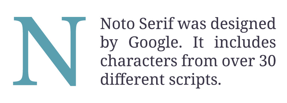
Serif fonts are widely used as body text in printed materials - the majority of the books on your shelf are printed in serif typefaces. It's thought that the serifs themselves aid in legibility and allow your brain to understand the words more quickly and easily, although some recent studies throw this into doubt.
Standard computer monitors used to render serif fonts quite badly making them hard to read, and so serif typefaces on the web have been used sparingly and only at large sizes for headings.
This is starting to change with higher-resolution monitors and techniques like hinting (changing how the font is rendered at small sizes), anti-aliasing (smoothing to make the letters crisper and cleaner), and subpixel rendering (increasing the resolution of a screen by making use of the red, green and blue pixels individually).
![]()
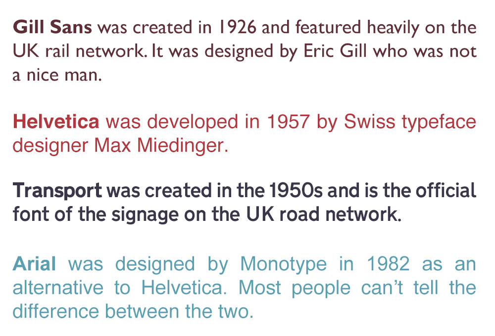
Famous serif typefaces include:
Sans serif fonts
As well as lacking the serifs of the fonts above, san serif fonts tend to be more uniform in the width of the lines that make up the letters. Together, these differences make sans serif fonts look more clean, modern and simple.
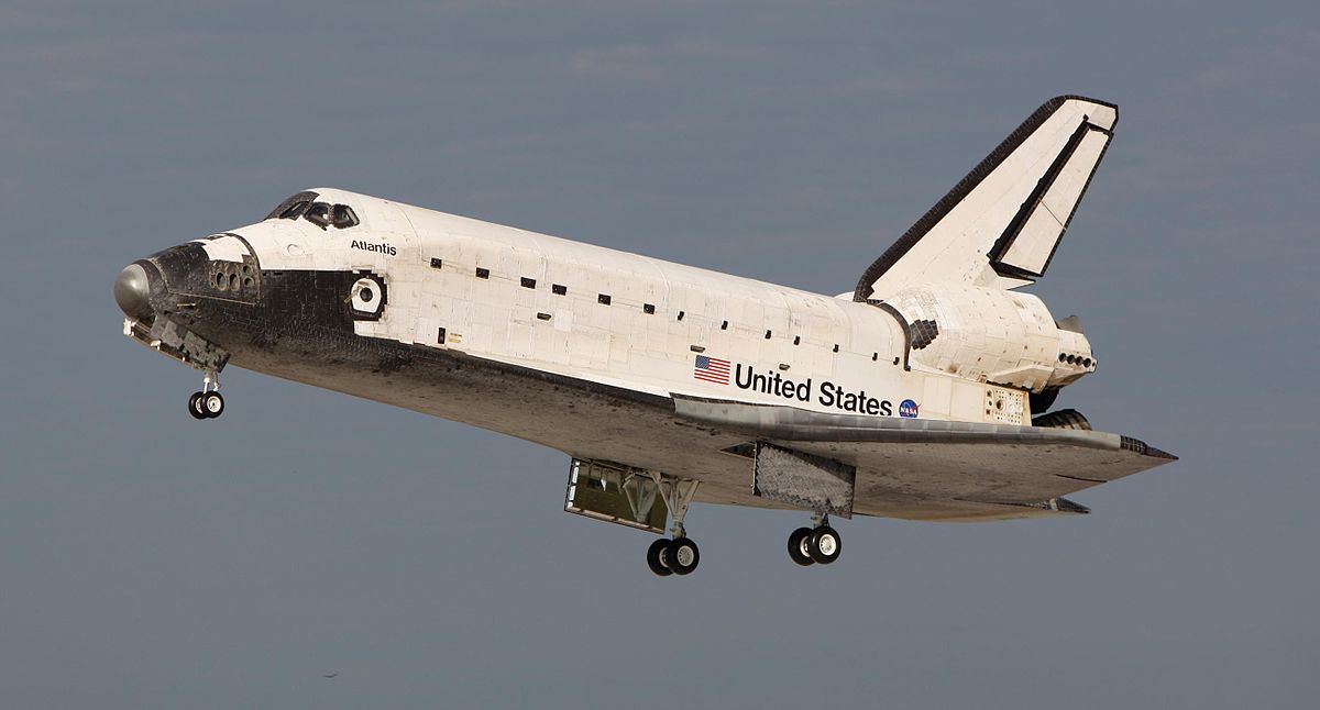
The most popular sans serif font is Helvetica, designed to be the swiss-army knife of typefaces by Swiss designer Max Miedinger, so famous that it even had a movie made about it. It's used in hundreds of corporate logos, and even made an appearance on the side of the Space Shuttle!
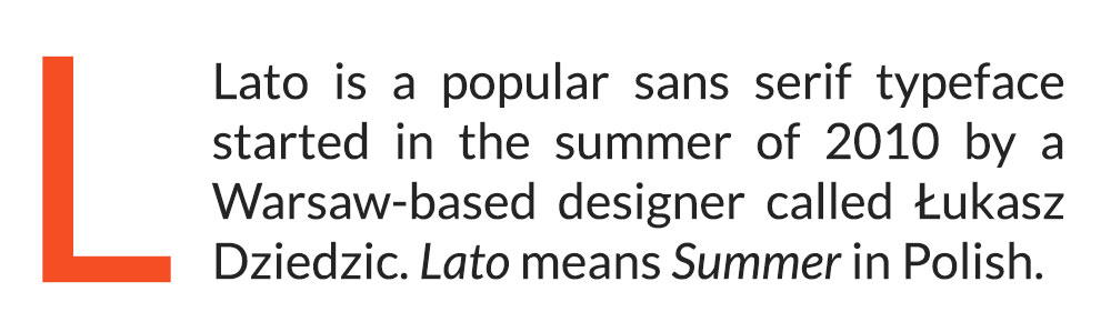
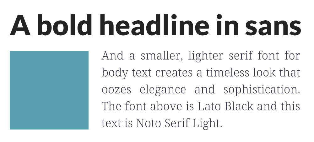
Sans serif typefaces are popular for text on computers, most text you read on the web is sans-serif. This text uses a popular sans serif font called Lato.
Some of the more famous sans serif fonts include:
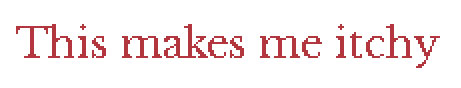
Script fonts
Script typefaces are usually intended to look handwritten, with a brush or a pen. They're often quirky and bold, but can be hard in smaller sizes or in larger blocks of text. The most famous example of a script typeface is, of course, our own Iteracy logo. or it could be Brush Script, designed in 1942 by Robert E. Smith and hated by most designers because of its overuse. Or maybe it's the legendary Comic Sans, designed by Microsoft in 1994 and hated by just about everybody! It's spawned several documentaries, websites and t-shirts:

Display fonts
Display typefaces are the odd-sock draw of the fonts world - pretty much anything that doesn't fit into another category. They're usually quirky or themed fonts and a usually only good for headlines and logos, designed to be shown at large sizes only because they're complex or hard to read in long passages of text.
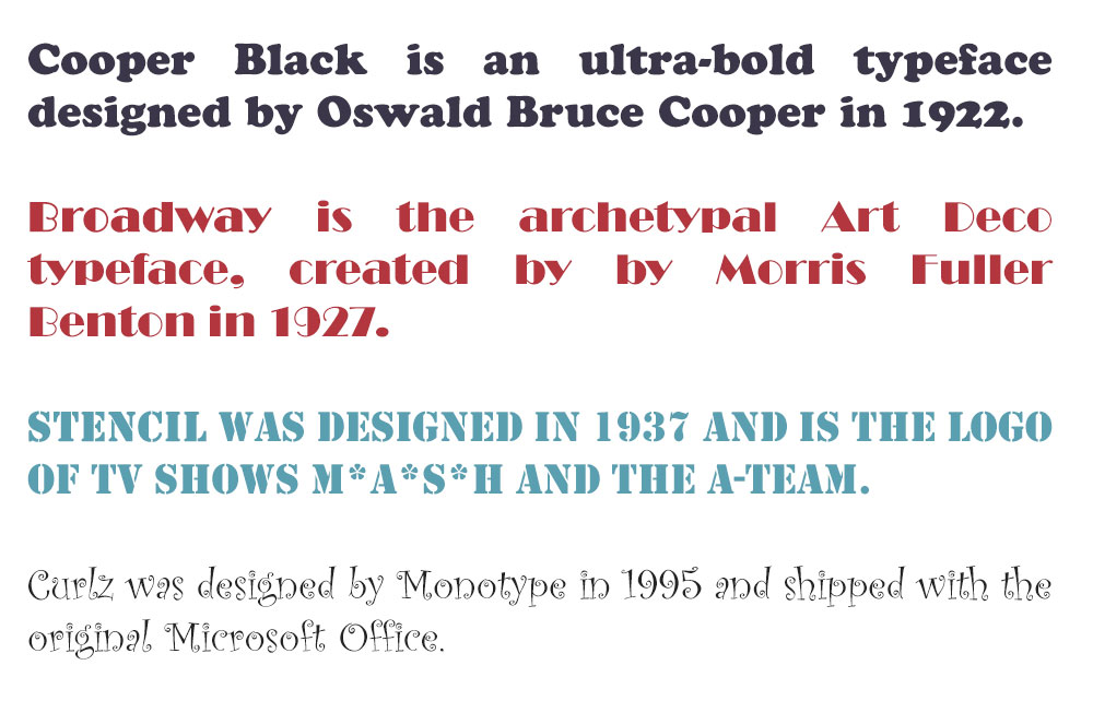
Popular display typefaces include:
Choosing fonts
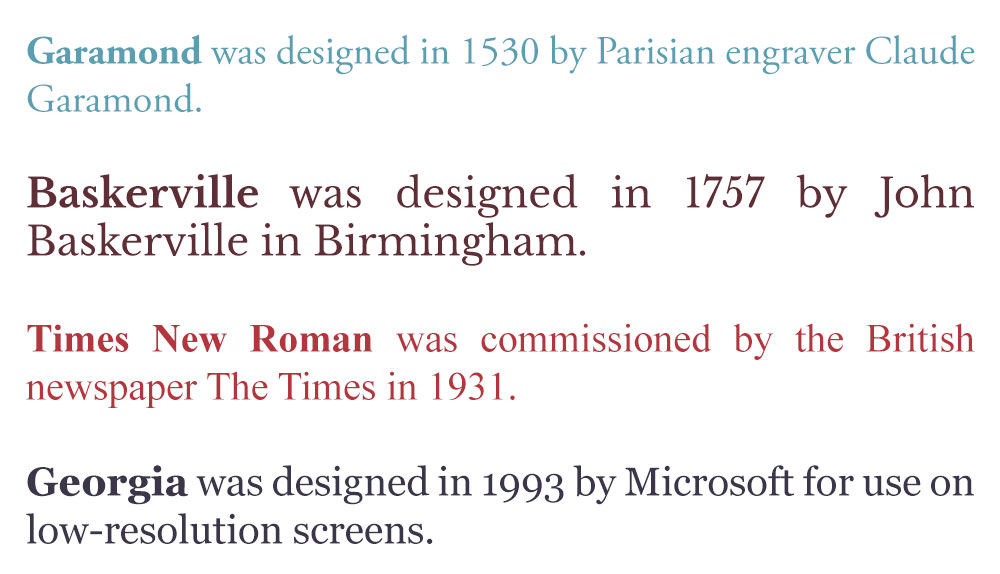
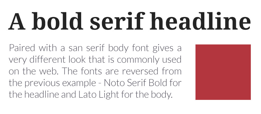
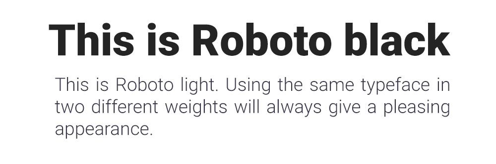
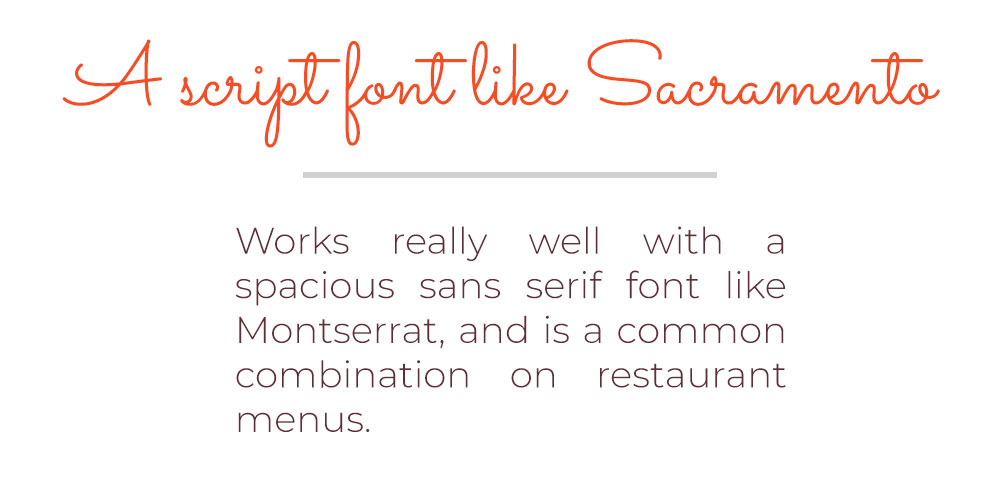
When it comes to using fonts, less is definitely more unless you're designing a 19th-century poster in which case use as many as you can. A common approach that professional designers use is font pairing, choosing one typeface for headings and another that complements it for body text. This allows you to use an interesting sans serif or display font for larger text but still keep your paragraphs readable.
Different pairings can look dramatically different:
How to (legally) use typefaces on websites
These days the best place to choose and download typefaces for your projects is Google Fonts. While they don't have the range of some online font stores, they're all freely available to use commercially. A typical commercial font store can charge £40 for 250,000 page views, which on a popular website isn't going to last long. Like everything on the web, you can find commercial fonts available to download for free, but these won't be licenced and so the designers of these beautifully-crafted typefaces aren't getting paid for their hard work.
In addition, Google fonts suggests popular pairings (at the bottom of the font details page) and FontPair can help you with inspiration.
In summary
We've come a long way since we used to cast metal into shapes and stamp them onto paper. The vast majority of my reading is done digitally now, which gives me a lot of control over the way text is displayed. Most browsers allow to make text on a page larger or smaller, text-heavy websites like Wikipedia allow you to choose your own font, and Amazon's Kindle gives you a wide array of font and display options. Gone are the days where a designer had complete control over how their work was viewed, which is especially great for people with accessibility requirements.
We hope you've enjoyed this brief adventure into the world of fonts, if you have a topic to suggest for a future design-related blog, get in touch!
Tagged under: Build a better website Hot topics Design Accessibility Marketing