Ten rules for great web design
Written by Mat
Every website is different, but here are ten simple rules that we follow in order to create a great-looking and functional website.
1. Use clear and easy-to-read fonts
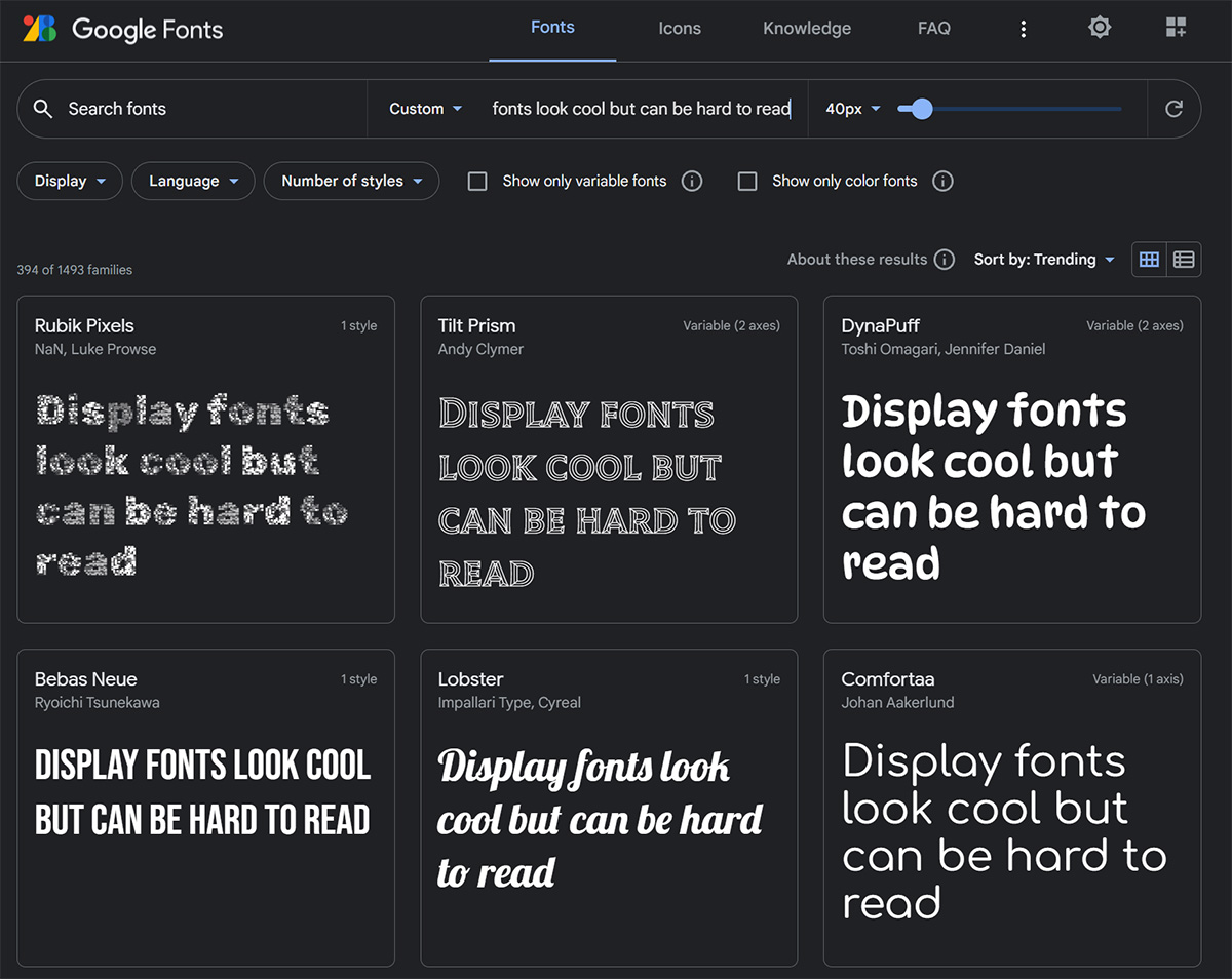
Choosing a font that is clear and easy to read is crucial for the usability of your website. Avoid using overly decorative or complex fonts that can be difficult to read, especially on smaller screens. If you're browsing Google Fonts for typefaces to use on your website, it's fine to use fonts from the categories Display or Handwriting in your headings, but the body text should be from the Serif or Sans-serif categories. Two fonts looks great on a page, more than three is just confusing.
2. Choose a colour palette that is easy on the eyes
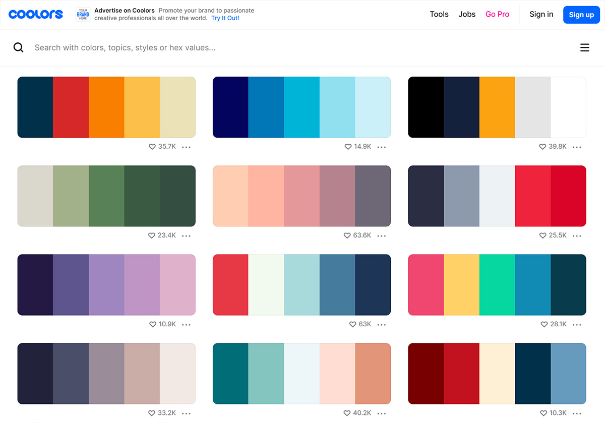
Your website's colour scheme should be visually appealing and pleasant to look at. Choose colours that complement each other and use contrasting colours for text and background to ensure readability. Keep in mind that colours can also evoke emotions and convey meaning, so consider your brand and target audience when choosing your colour scheme. Try websites like Coolors and Colourlovers to find colour palettes, and use Contrast Checker to make sure that there's enough contrast between your text and background colours to pass accessibility requirements - aim for at least AA standards. Pick a palette of no more than five colours and use them carefully.
3. Ensure your website works across all screen sizes and browsers
Many websites now have more mobile visitors than any other screen size, so it's essential that your site is mobile-friendly. A responsive design will ensure that your website adapts to different screen sizes and orientations, providing a seamless user experience on all devices. Use Google's Mobile-Friendly Test to check. Your website may look and function differently on different devices and browsers, so it's important to test it thoroughly. Test your website on different devices and browsers to ensure it's responsive and functional across all platforms.
4. Keep your website navigation simple and consistent
Your website's navigation should allow visitors to find what they're looking for quickly and easily. Use clear and descriptive labels for your navigation links and organise them in a logical order. Keep your website navigation simple and intuitive, and avoid using too many dropdown menus or submenus - very few people can successfully navigate more than two levels of navigation. Make your website navigation consistent, appearing in the same place on every page.
5. Ensure your website loads quickly
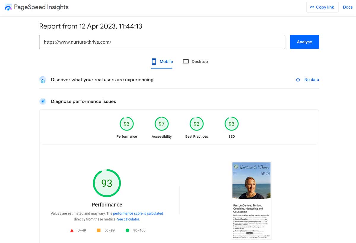
Website speed is crucial for user experience and search engine optimisation. Keep your website loading time to a minimum by optimising images and compressing files. A fast-loading website will keep visitors on your website for longer. Use Google's PageSpeed Insights to check page loading speed and aim for a score in the 80s on mobile and the 90s on desktop. Use a site like PNGCompressor to make your images smaller.
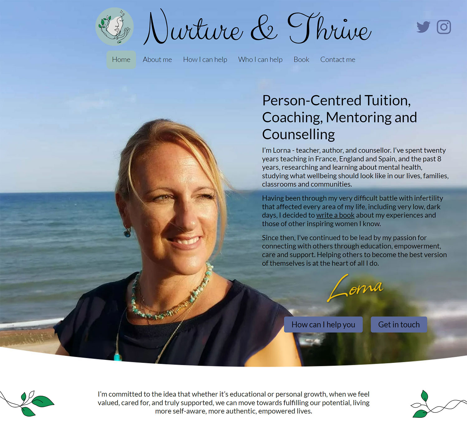
6. Use high-quality images and graphics

Visual content is so important, but it's essential to use high-quality images and graphics to ensure a professional look and feel. Avoid using blurry or low-resolution images that can make your website look bad. Use high-quality, relevant images and graphics to support your content and enhance the user experience. If you're taking photos on your phone for the website, make sure you clean the lens before you start! If you're low on budget, try free image libraries such as Pixabay and Unsplash.
7. Keep it simple
We all expect to find answers to our questions quickly when visiting a website, so make sure that key information and links to the most popular sections are included prominently.
On the home page, this might look like a succinct description of the site with links to read an About page or to Get in touch, plus feature boxes linking to particular sections. On an inside page, there could be a summary paragraph at the top explaining what the page or section contains before a link to Read more or further text divided by subheadings.
If people regularly return to your site to find a phone number or view a map of your location, make sure those details are easy to access.
8. Use calls to action (CTAs) to guide visitors through the website

CTAs are usually large, clearly-labelled buttons and are an effective way to guide visitors through your website and encourage them to take specific actions. Use clear and compelling CTAs that stand out on your website to improve user engagement and drive conversions.
9. Make sure your website is accessible to everyone
Web accessibility is important to ensure that all users, including those with disabilities, can access and use your website. Follow accessibility guidelines and best practices, such as using alternative text for images, captions for videos, and using clear and descriptive labels for form fields. Use WAVE to test your website which is available as a browser plug-in or axe Dev Tools Chrome browser plug-in.
10. Don't annoy your visitors!
We're looking at you, pop-ups. While pop-ups can be effective for lead generation or promoting special offers, using pop-ups that are intrusive or annoying can drive users away from your website. Use pop-ups sparingly and ensure they're relevant and easy to dismiss. Similarly, autoplay videos or music can be distracting and annoying, especially if your visitors are on mobile in a public setting. Avoid using autoplay videos or music on your website, or at least provide a way for users to easily pause or mute the audio.
Following these simple rules helps to create an effective and engaging website that your visitors will like! If you'd like to talk about how we can help with your website, please get in touch today.
Tagged under: Build a better website Design Accessibility Content